BLUE
Multi-Location Website Strategy
Website Development
Ongoing Website Management
Photo Production, Art Direction, Editing
BLUE
Multi-Location Website Strategy
Website Development
Ongoing Website Management
Photo Production, Art Direction, Editing
The
Challenge
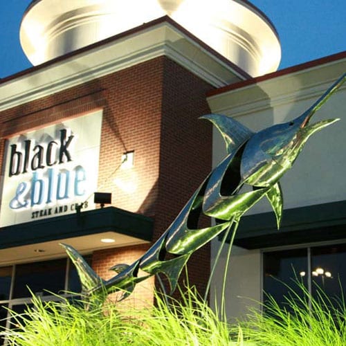
Black & Blue Steak & Crab is a distinguished dining brand known for its prime-aged beef and premium shellfish in New York (Buffalo, Rochester, Albany) and Massachusetts (Burlington, Wellesley). Its restaurants are renowned for combining quality cuisine with stylish ambiance, setting the brand apart in the upscale dining market.
In 2015, B&B partnered with UCO to digitize their unique dining experience, resulting in the creation of their first website. This initiative captured the brand’s elegance and each location's unique vibe, establishing a unified online identity.
In 2024, UCO introduced a more sophisticated multi-location website for the brand, integrating the latest development techniques and analytics to enhance user experience in line with contemporary trends. This showcases UCO's commitment to evolving digital solutions that align with our clients and their customers' evolving needs.
The
Challenge
Black & Blue Steak & Crab is an upscale restaurant chain spanning from New York (Buffalo, Rochester, and Albany) to Massachusetts (Amherst).
With a menu focused on aged beef and shellfish, the company has succeeded as a top choice for seafood lovers.
From a chic interior and exterior, UCO needed to develop and design a multi-site website as well as create brand assets to best represent each location - all while remaining consistent and cohesive to its physical form.

ON THE
WEB
1.
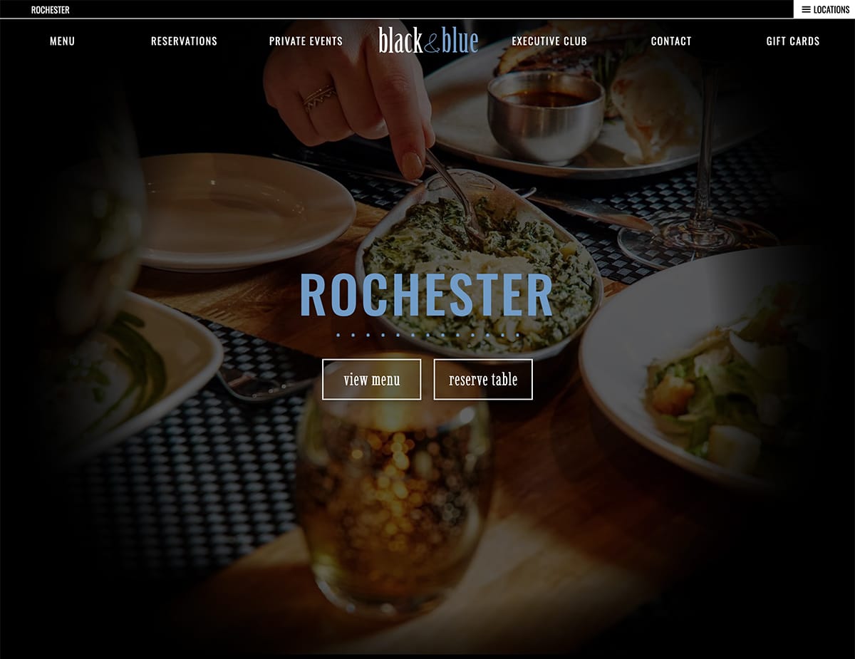
Upon landing on the website, the user is greeted by B&B's sophisticated design and inspiration for cuisine.
Additionally, visitors can easily switch between its four restaurants at the super-top navigation bar.
2.
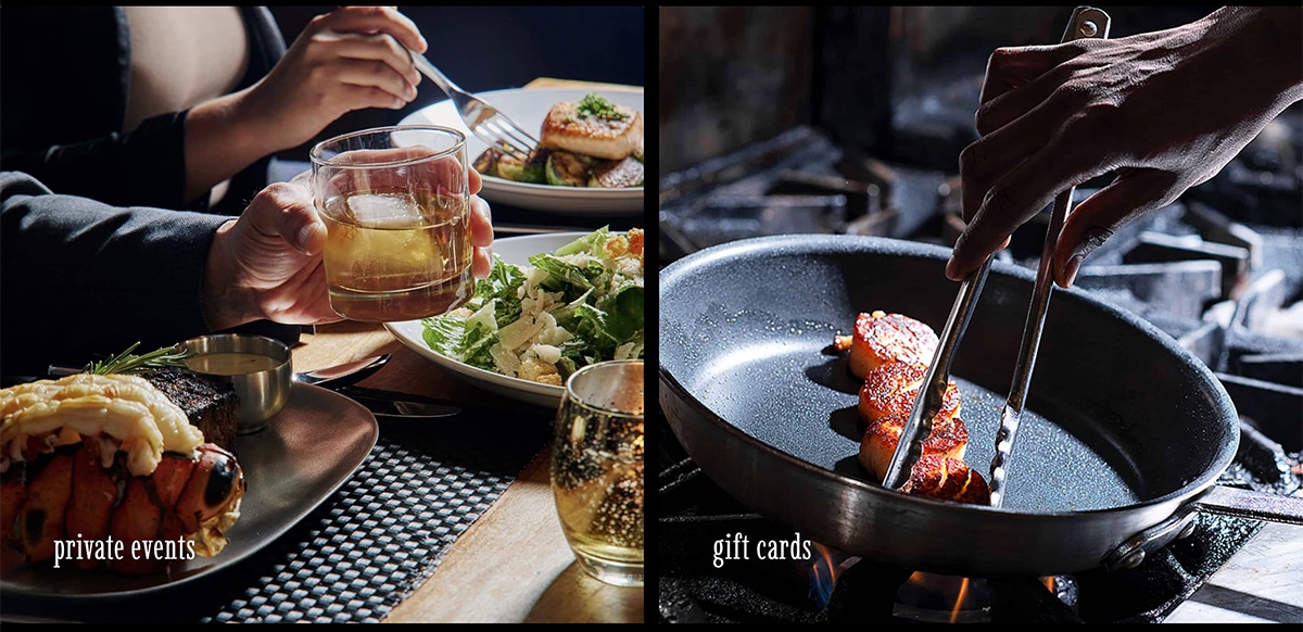
Analytics highlight that, following 'View Menu' and 'Reserve Table', the most sought-after features are private events and gift card inquiries.
Clear, accessible links to these services are therefore prioritized on the landing page.
3.
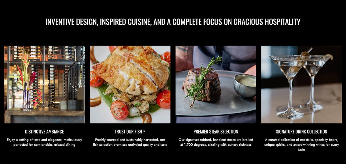
This section showcases four key attributes that draw guests to B&B. These points are presented to tempt and engage visitors.
4.
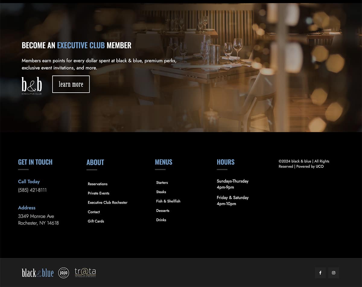
Toward the bottom, the landing page introduces the B&B Executive Club, followed by the footer which consolidates essential contact information for user convenience.
1.
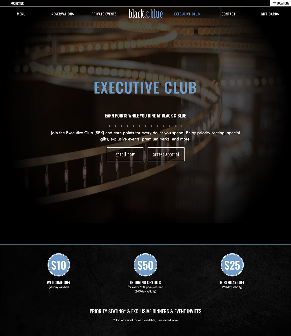
The Executive Club page is crafted with a strategic emphasis on the two primary actions that B&B wants visitors to take.
This design choice is purposeful to provide a succinct overview of the club's benefits, nurturing immediate engagement and a straightforward path to membership enrollment.
2.
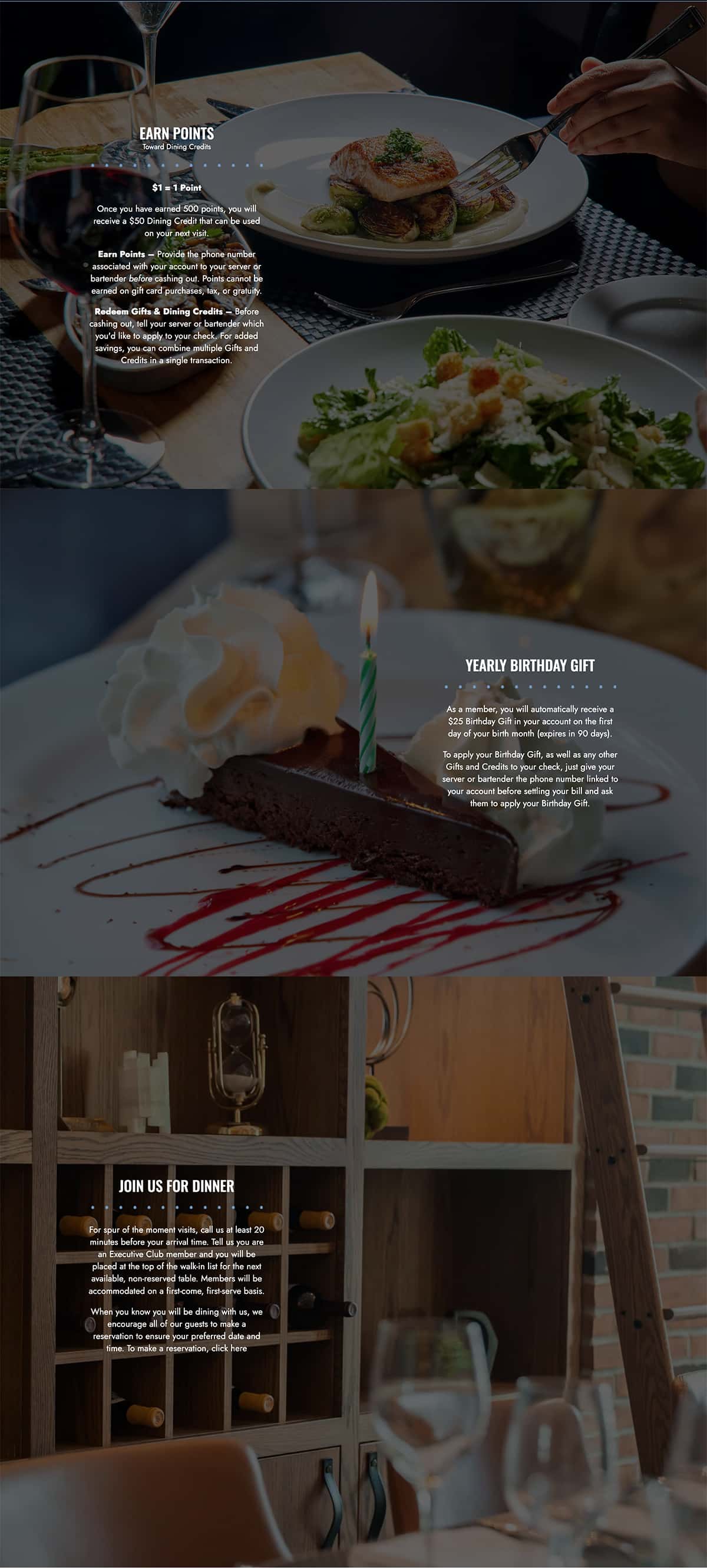
The design breaks down the Executive Club's offerings into three clear, concise components.
This structure ensures that the information is accessible and immediately understood, facilitating an effortless understanding of the value proposition offered to club members.
3.
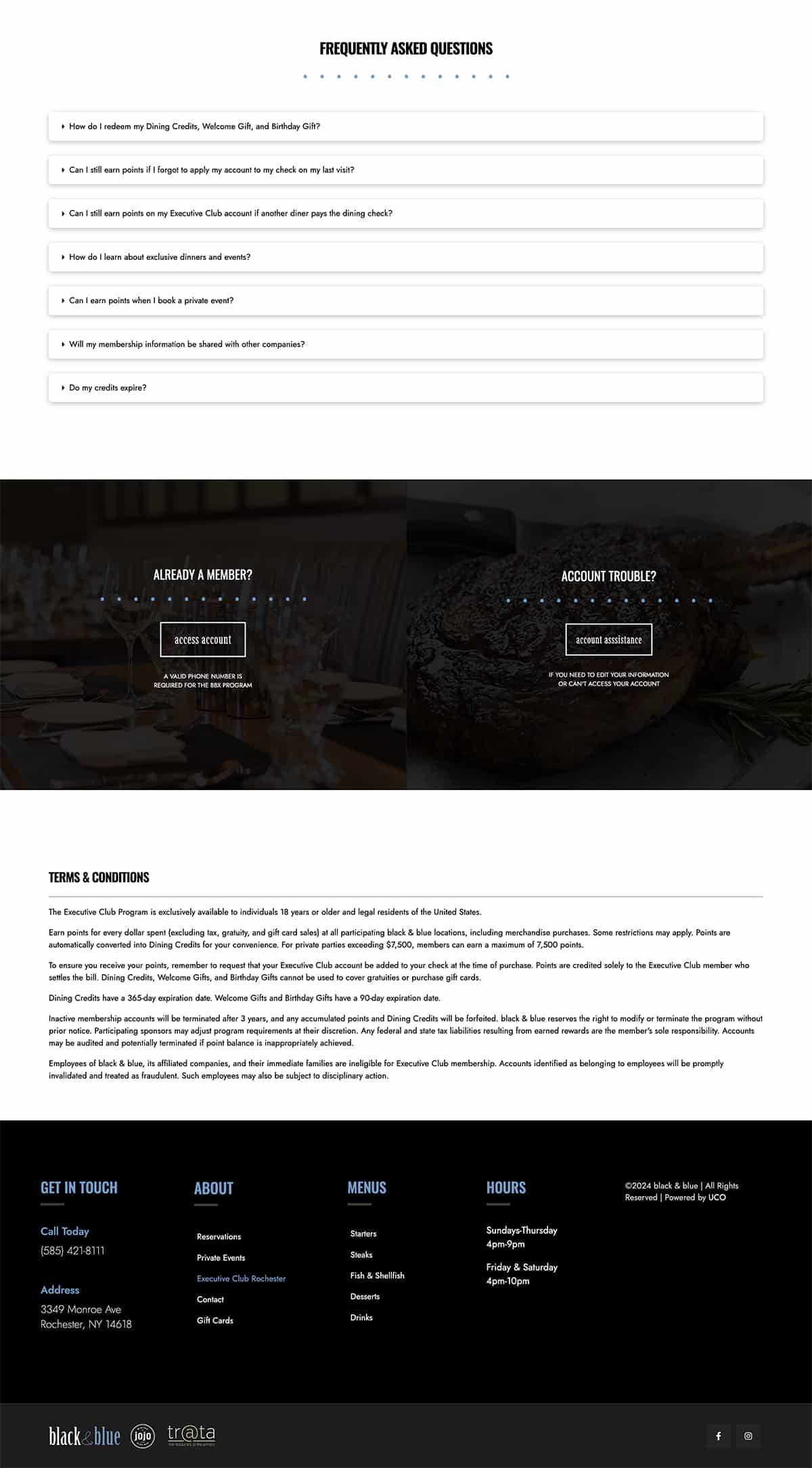
The FAQ section smartly contains the residual queries that site visitors may have.
This section is positioned to provide answers to less common inquiries, keeping the main content uncluttered and focused.
PHOTO
Production
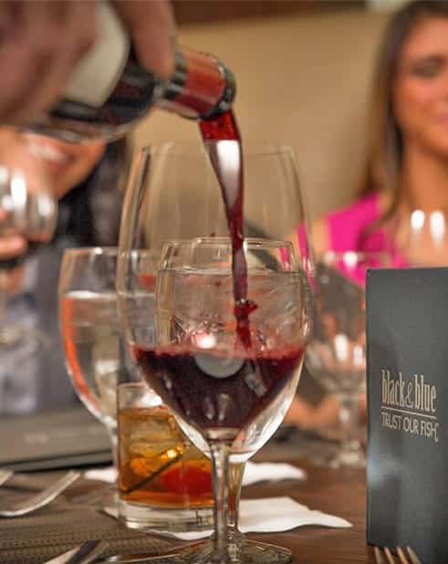
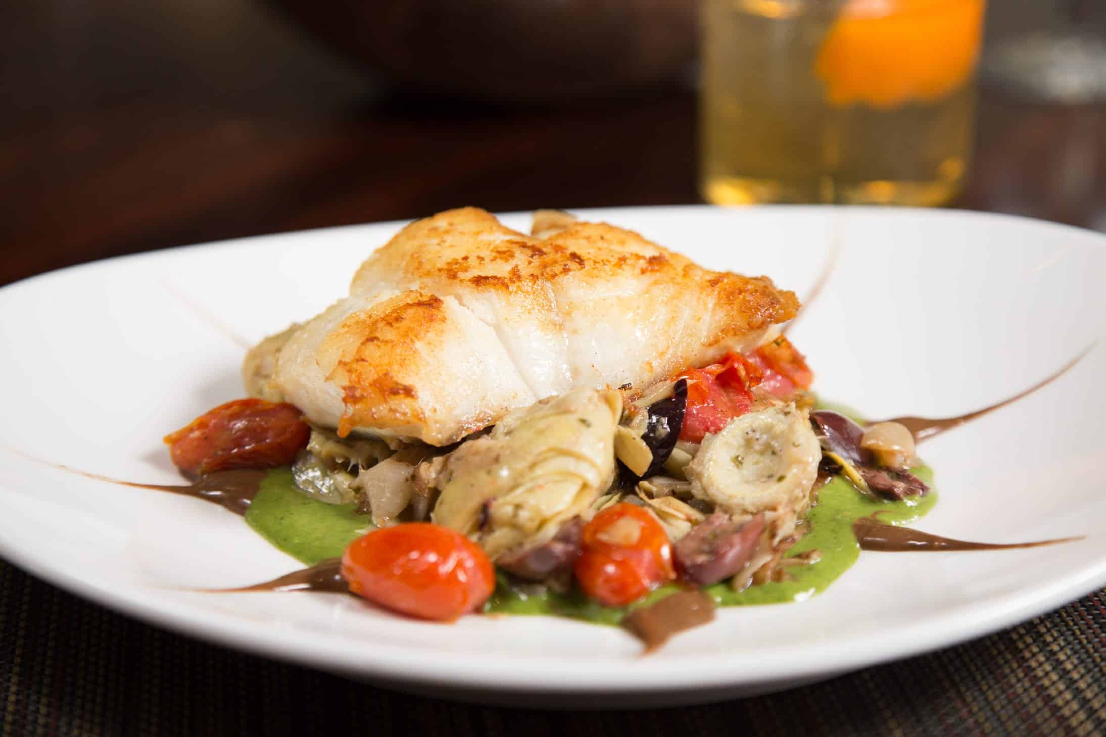
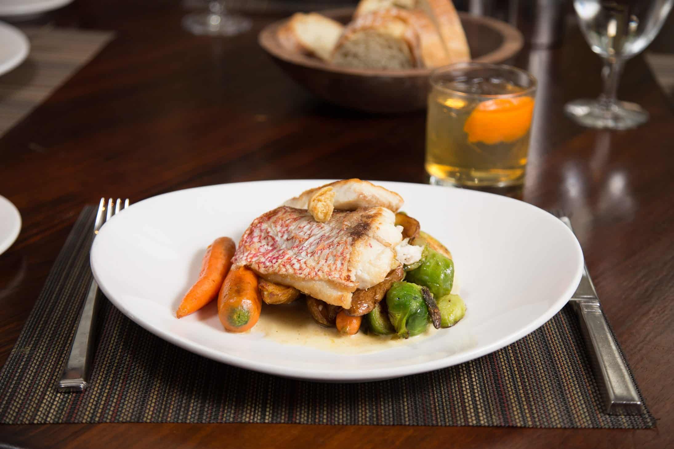
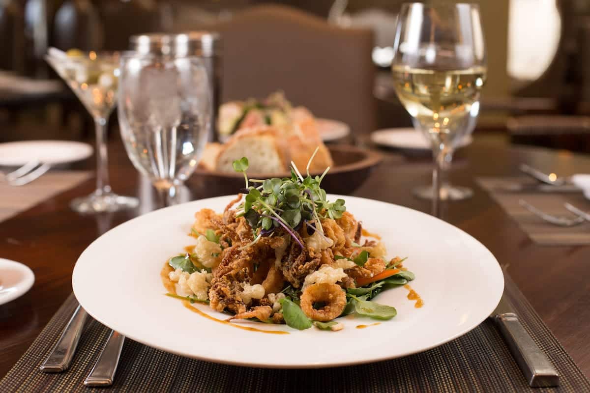
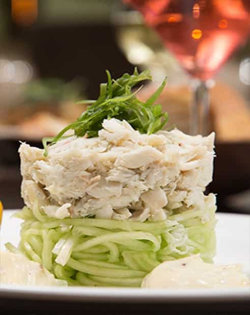
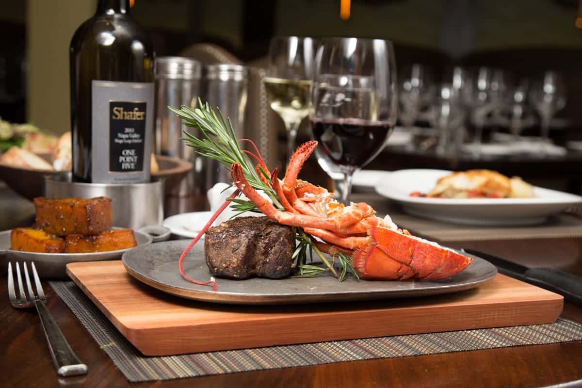
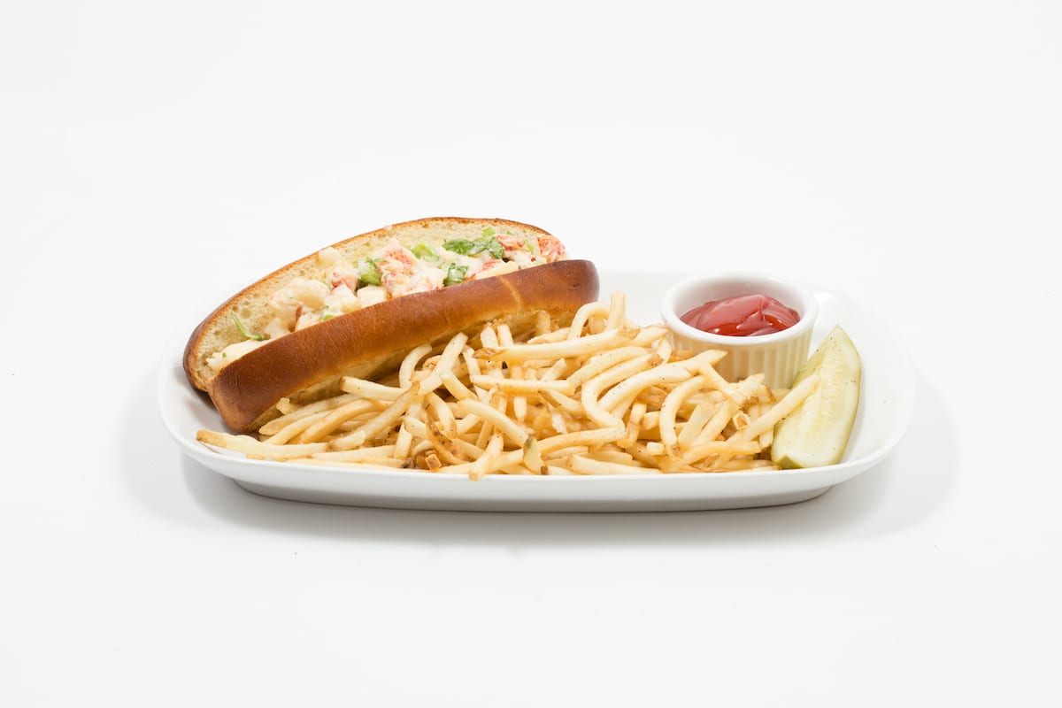
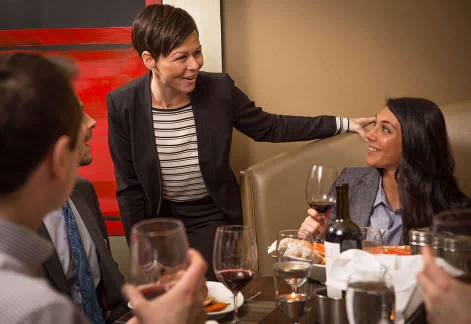
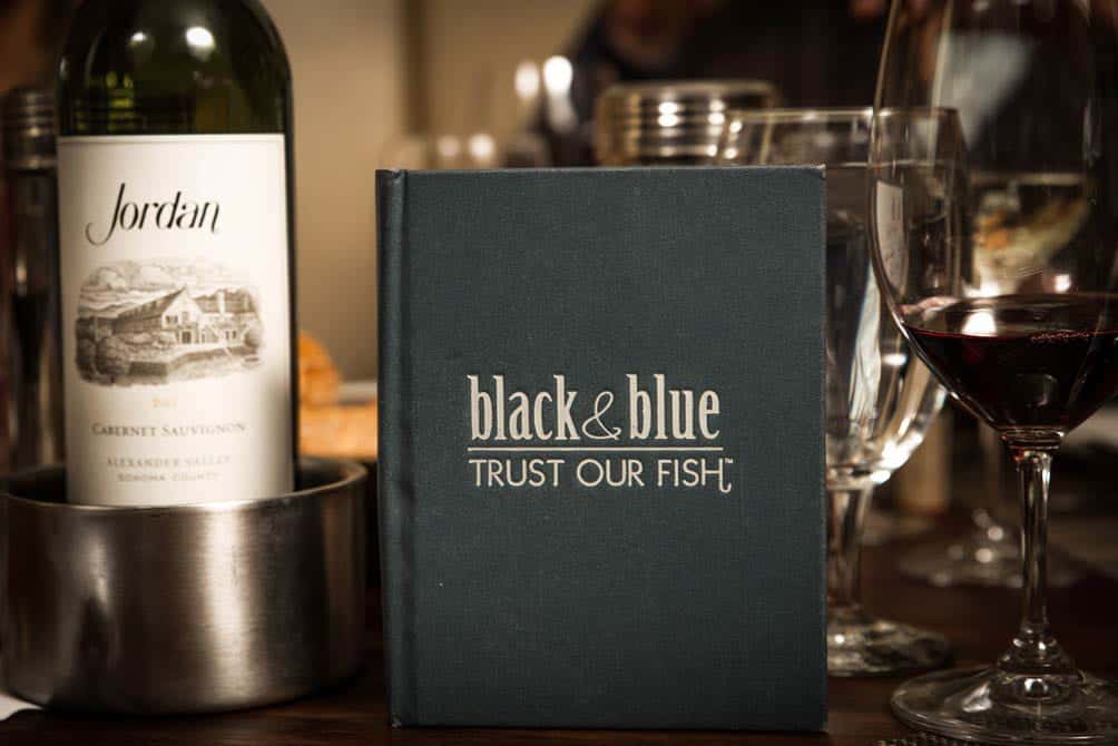
To enhance the brand, we took a variety of candid and food photography shots with the ability to include on any and all integrated marketing communications.
All in all, it was important for us to represent the B&B essence, which is one of chicness, class, and elegance from presentation to atmosphere.



Are you a fit for us?
Are you a fit for us?

