Celestial Dental

CELESTIAL
DENTAL

Brand Strategy
Brand Identity Development
Website Design & Development
All Creative Communications

CELESTIAL
DENTAL

Brand Strategy
Brand Identity Development
Website Design & Development
All Creative Communications

The
Challenge

"How do I seriously differentiate myself being the youngest dental practice owner in Monroe County among other highly respected, well-established dentists in the area?"

This was the very question asked by the doctor when first sitting together to discuss his perceived challenges and goals in building a brand new dental office in Henrietta, NY.

Since the initial thought of starting a practice to opening the office doors one year later, UCO overcame this challenge by single-handedly developing a nameless brand into something unlike any other dental practice in Upstate NY.

Image

The
Challenge

"How do I seriously differentiate myself being the youngest dental practice owner in Monroe County among other highly respected, well-established dentists in the area?"

This was the very question asked by the doctor when first sitting together to discuss his perceived challenges and goals in building a brand new dental office in Henrietta, NY.

Since the initial thought of starting a practice to opening the office doors one year later, UCO overcame this challenge by single-handedly developing a nameless brand into something unlike any other dental practice in Upstate NY.

THE
LOGO

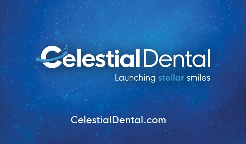
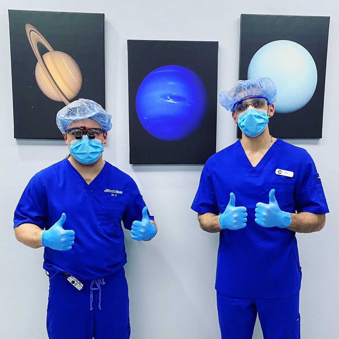
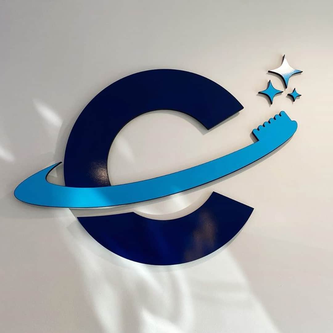
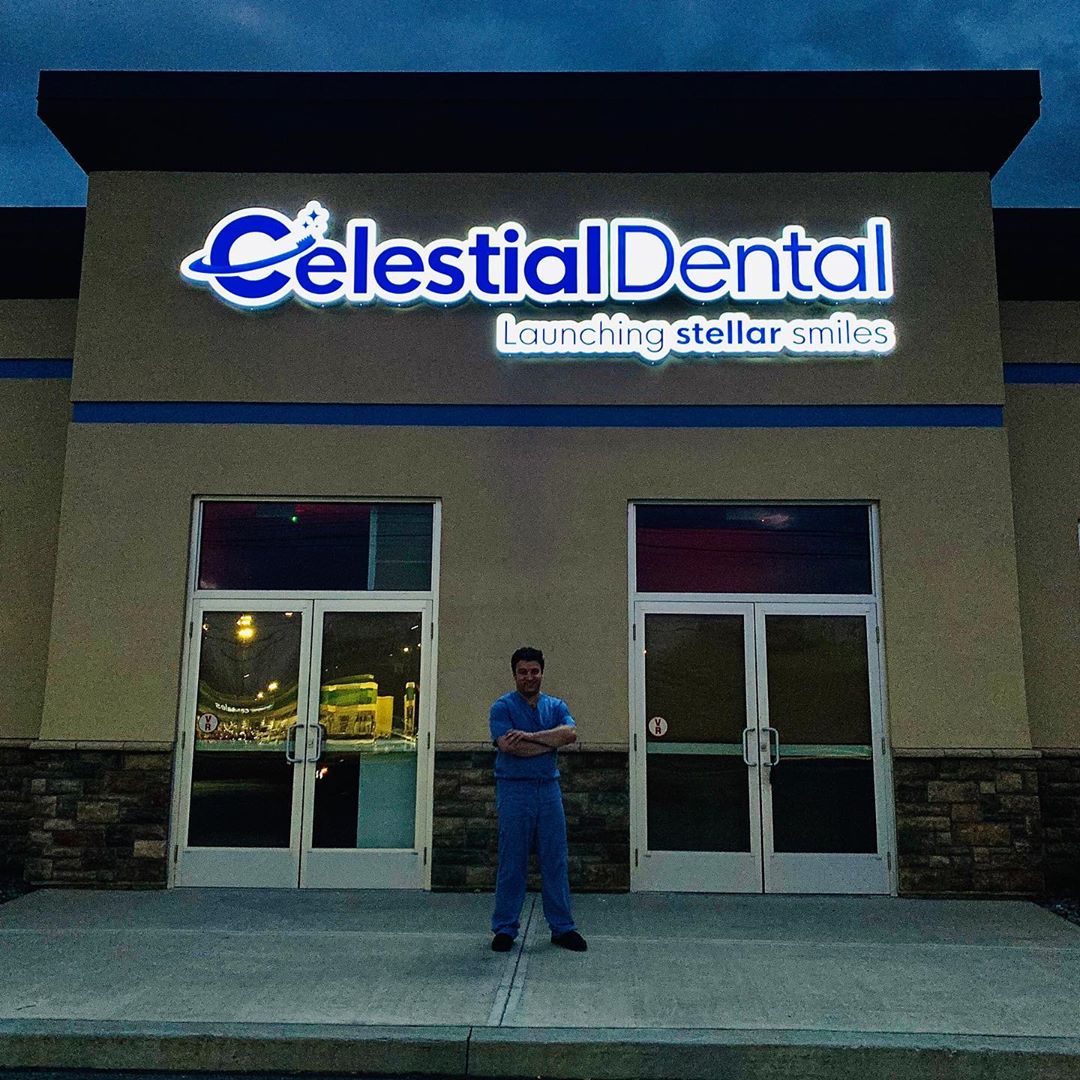
In order to maintain a unique identity among other dental offices that assume their name from the owner or the location in which they are based, Dr. C and UCO together named "Celestial Dental" with the agreed slogan "Launching Stellar Smiles".

By combining the doctor’s two passions in dentistry and astronomy, the brand and corresponding assets serve as a core differentiator among dental offices in the area.

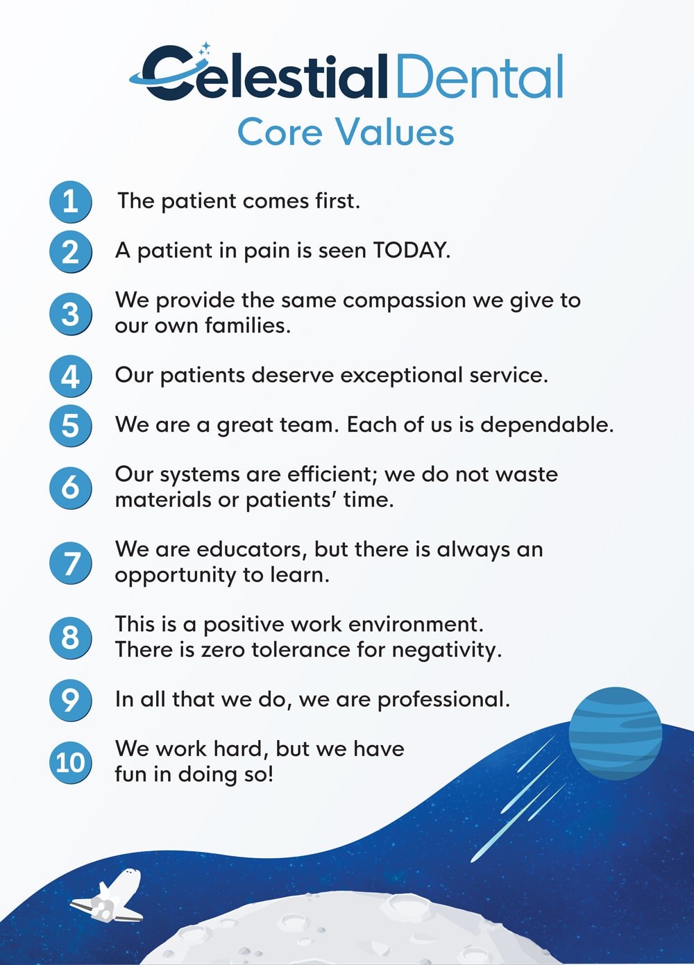
The primary objective of the brand identity was to make Dr. C's personality come alive by tastefully merging his two biggest passions into one. The secondary objective was to position the brand far away from the boring and often times fearful feeling of visiting the dentist.

Image


Image

ON THE
WEB

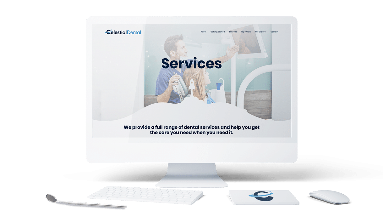
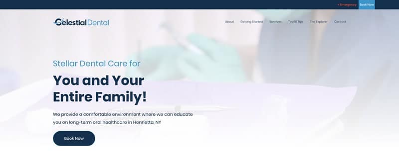
We extended the brand's identity seamlessly online by designing a fully-customized website married with a clean, interactive, and easily digestible interface. 

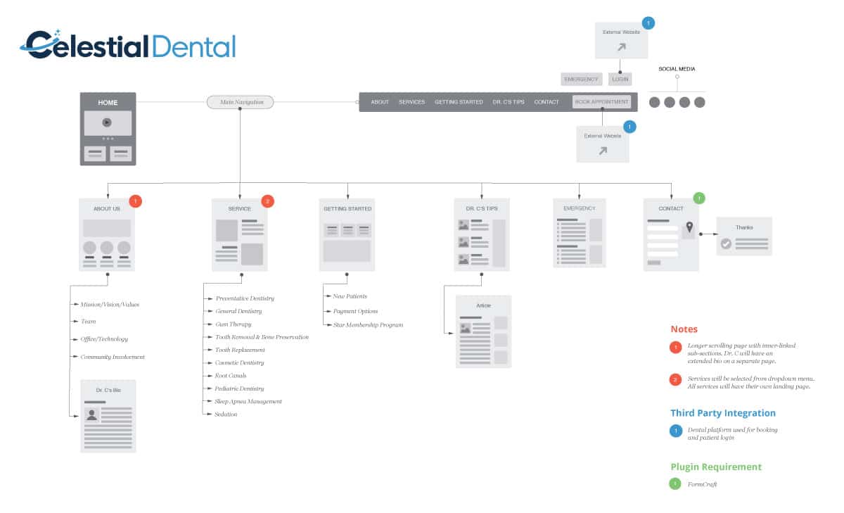
Below is the initial sitemap blueprint used when discussing and developing the full website.
Image

CUSTOM
ICONS

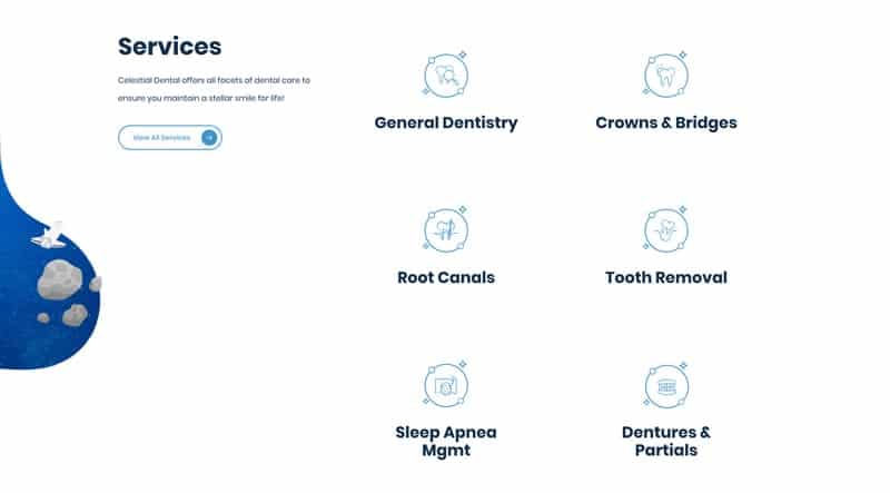
We developed key icons alongside services to refine the brand, adding an additional layer of familiarity, comfortability, and approachability to potential and current patients. 
LAUNCHING STELLAR SMILES

1.

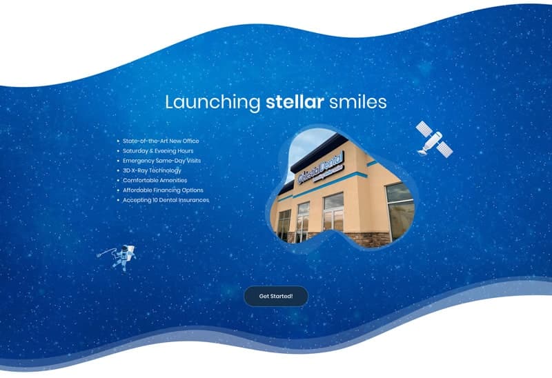
Upon landing, the website presents the company's mission alongside a clean display of the central call-to-action.

Image

2.

Cutting to the chase, we highlight the top 7 core differentiators of the dental office for visitors to learn.

Image

3.

Continually reducing the potential feeling of fear and anxiety, we then give a summary of the product offerings with their respective icons.

ImageImage

4.

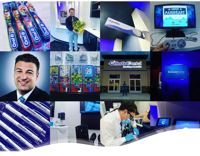
Dental office social media feeds are completely boring, blah, and totally un-Instagrammable. Not only did we want to show our viewers than Celestial's is not, we wanted them to immerse themselves with the brand, the doctor, and the building itself.

ImageImage

5.

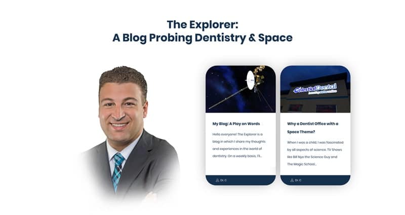
We knew giving potential patients a positive first impression and strengthen connection with Dr. C was important. This is why we closely and creatively collaborated with the doctor to develop a fun blog to give the doctor an authentic literal voice for his two passions.

Image

6.

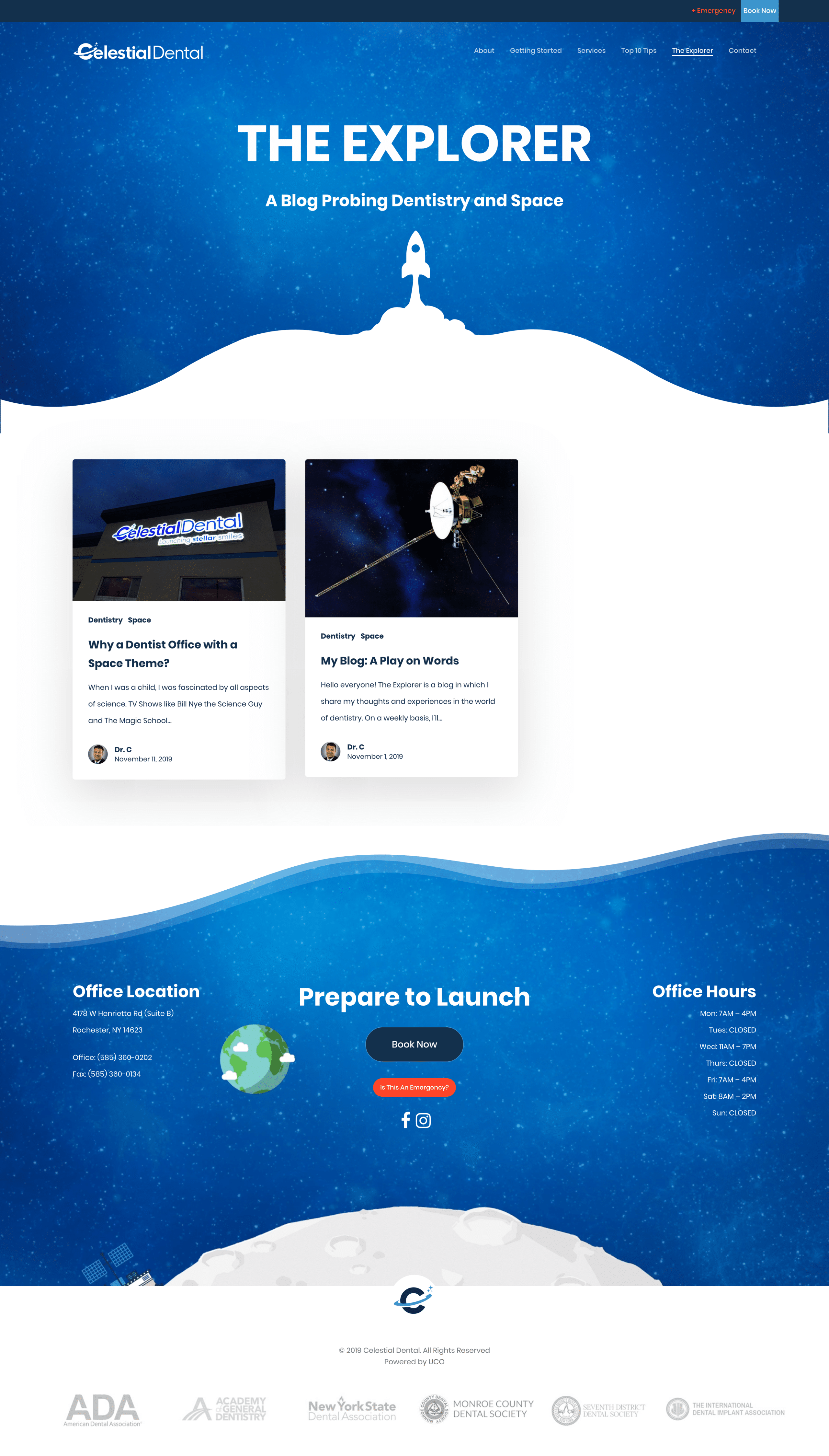
Until the very end of one's scroll, we continue to prove to potential patients that Celestial thinks outside of the box with every detail.

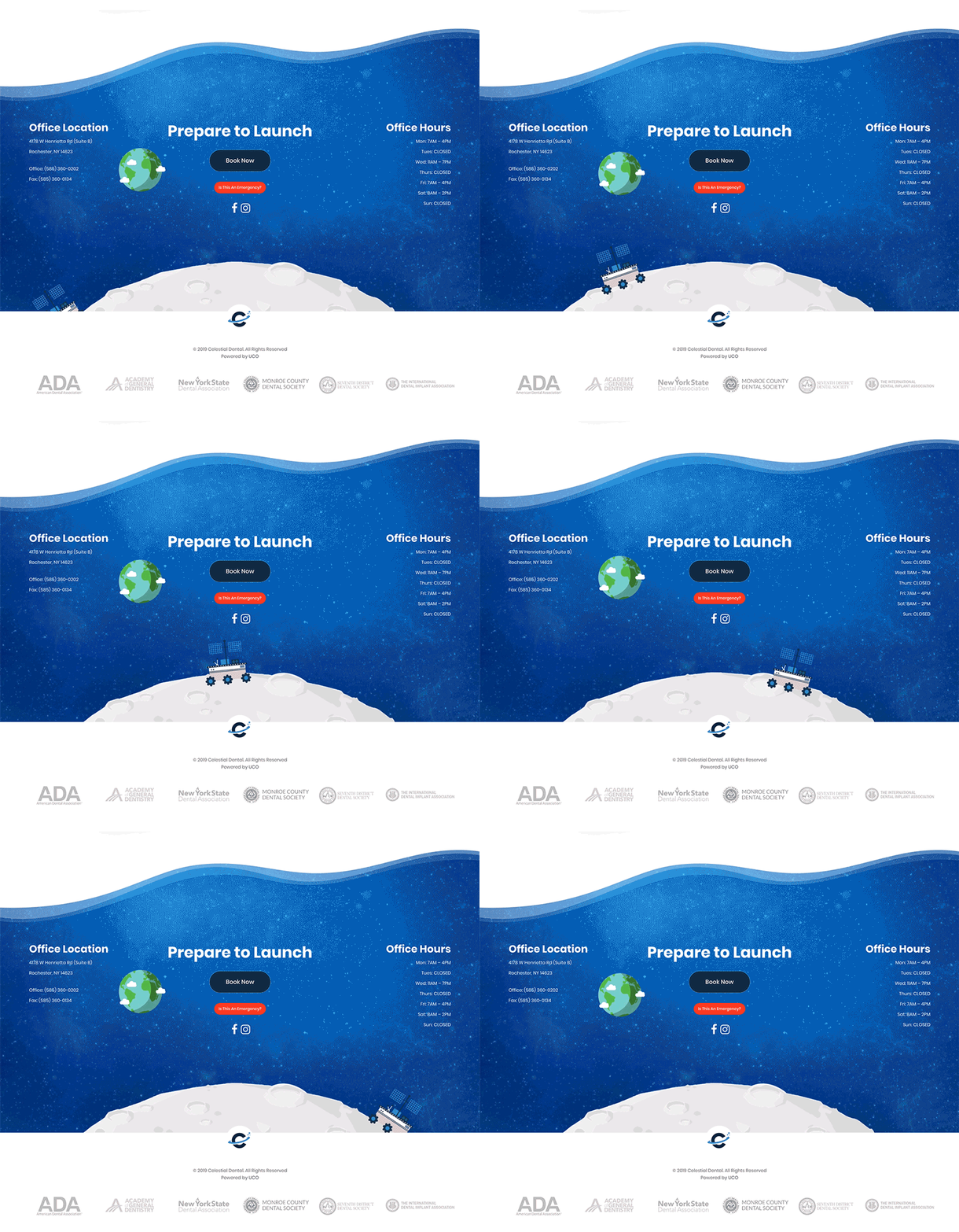
We accomplished this by not only including necessary contact information, but incorporating a fun, animated lunar probe traveling the moon!

Image
 
Image

a play on words

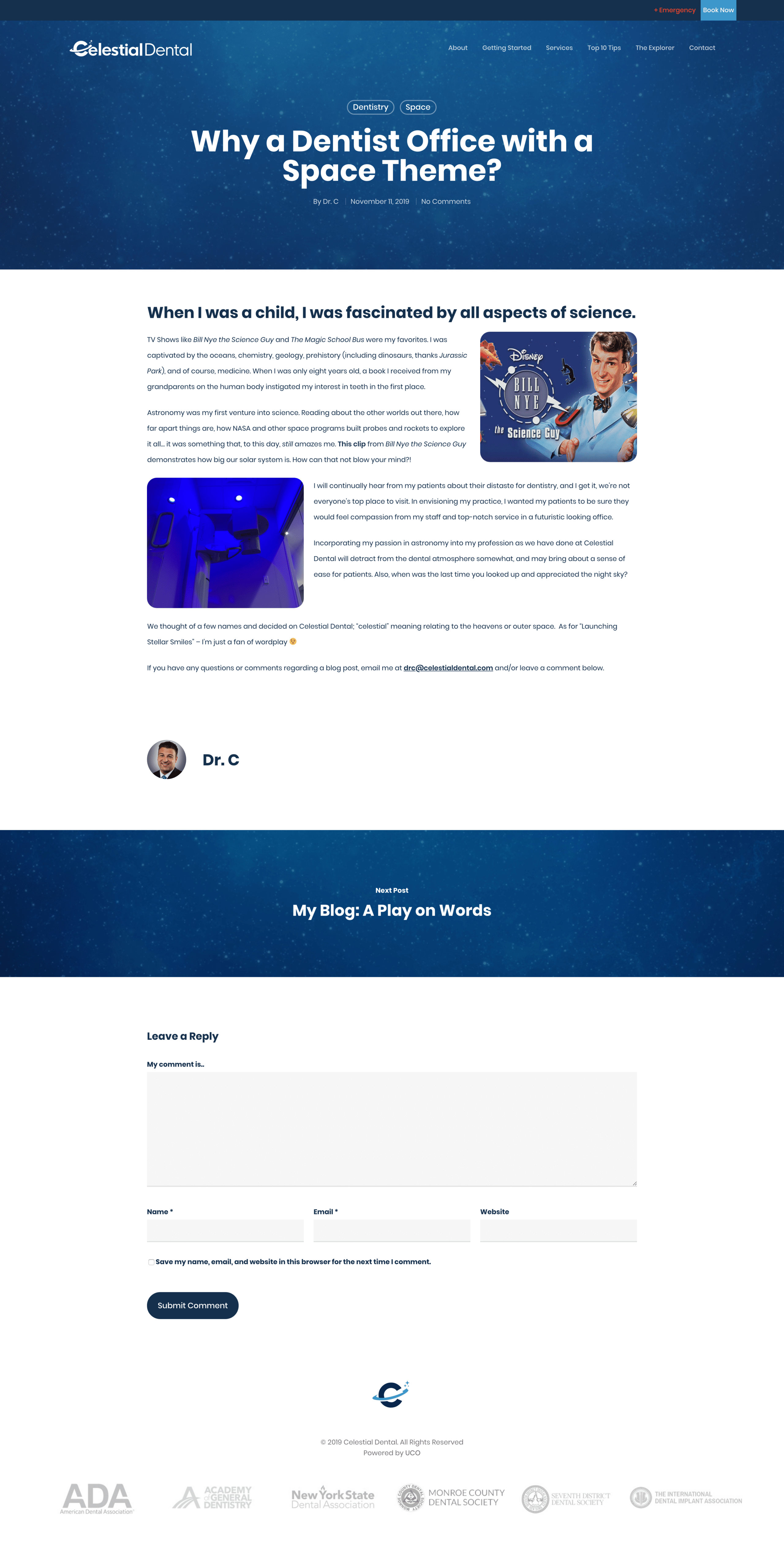
We collaborated with Dr. C to develop a clever blog name. A dental explorer is one of the most famous of all of the dental instruments; whereas, a space probe is a robotic spacecraft used to study space and celestial objects.

 
Image
Image

IN
PRINT

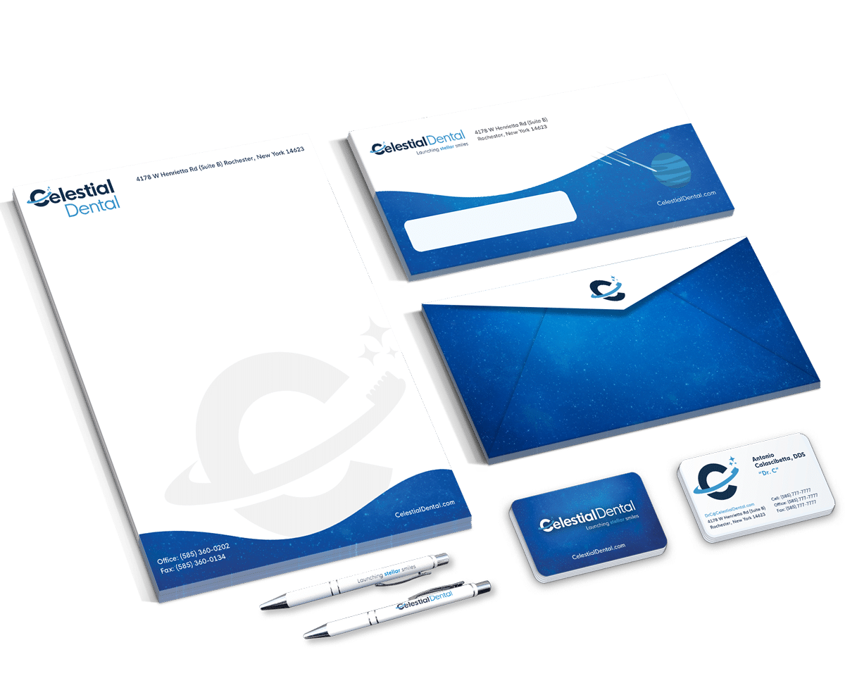
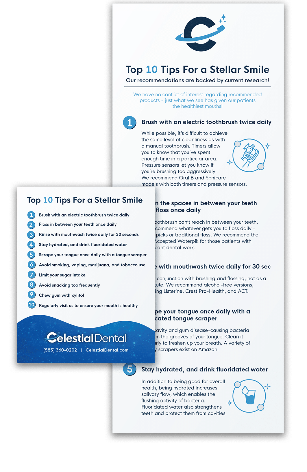
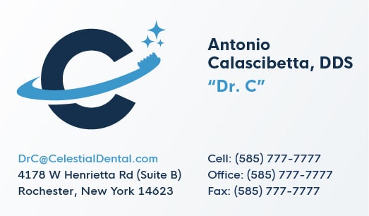
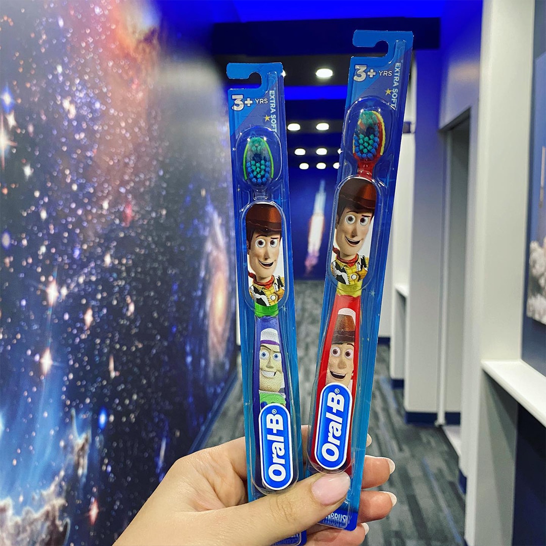
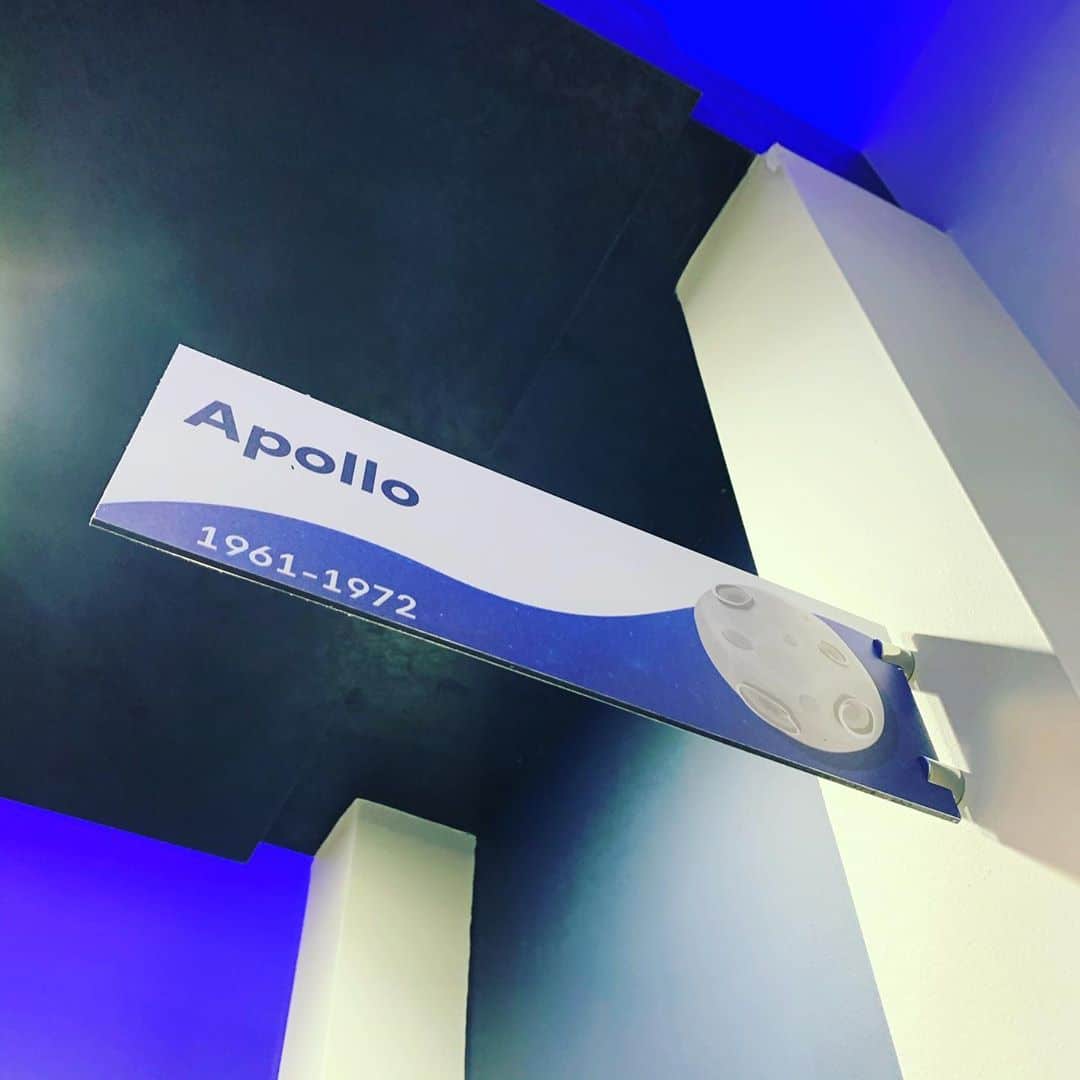
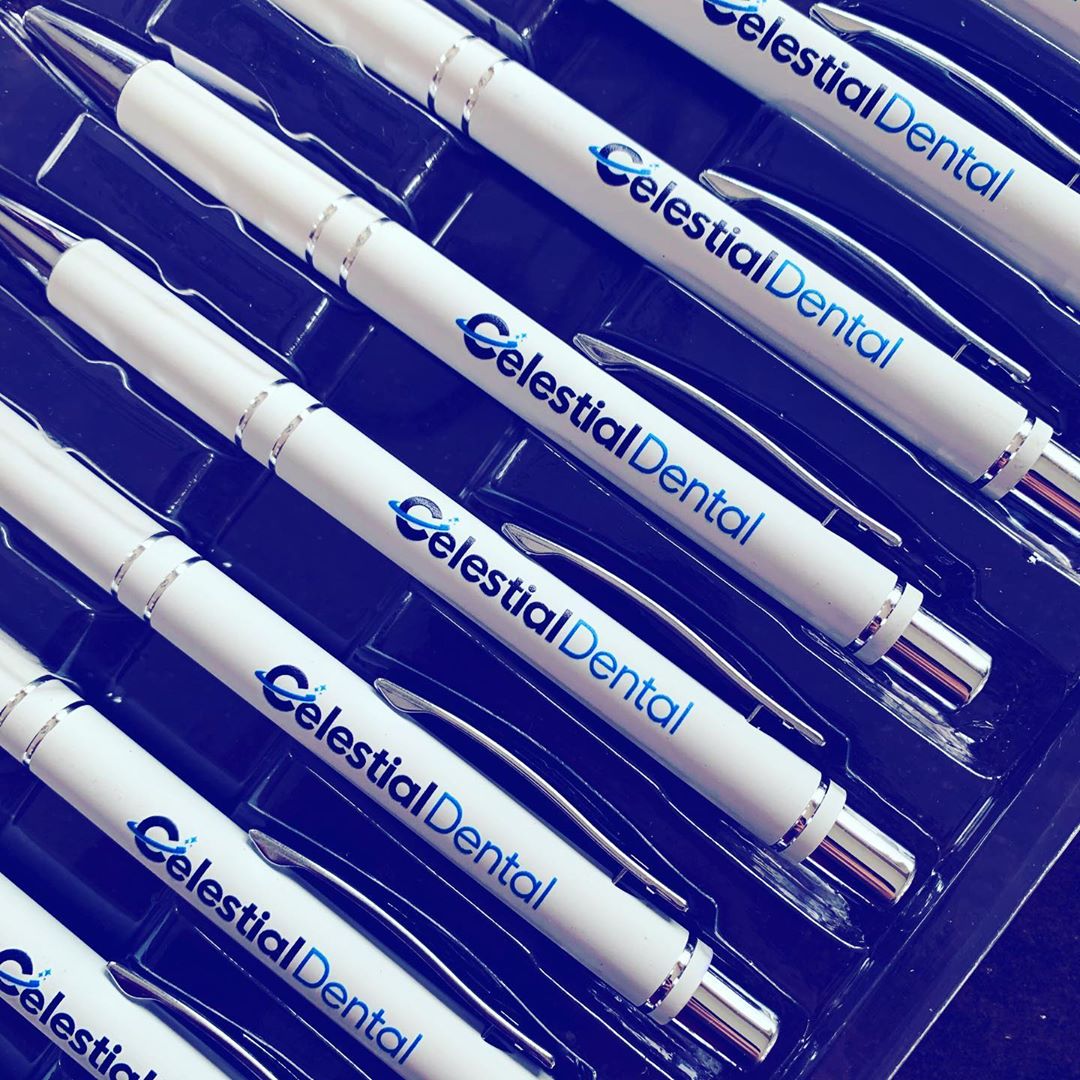
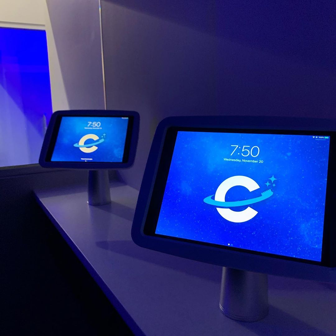
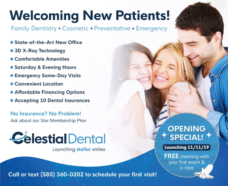
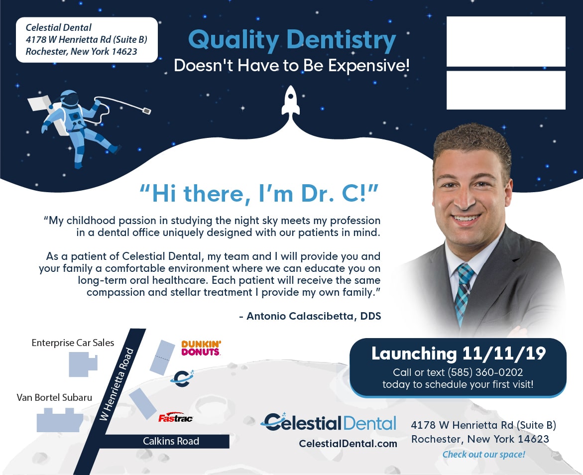
Extending the brand, we developed, designed, and managed print for every branded touchpoint to strengthen and unify the brand altogether. This included business cards, letterheads, envelopes, pens, direct mailers, branded desktop/iPad backgrounds, patient check-in forms - you name it!

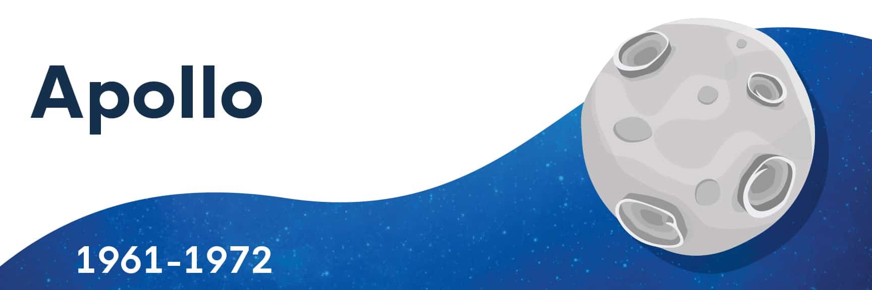
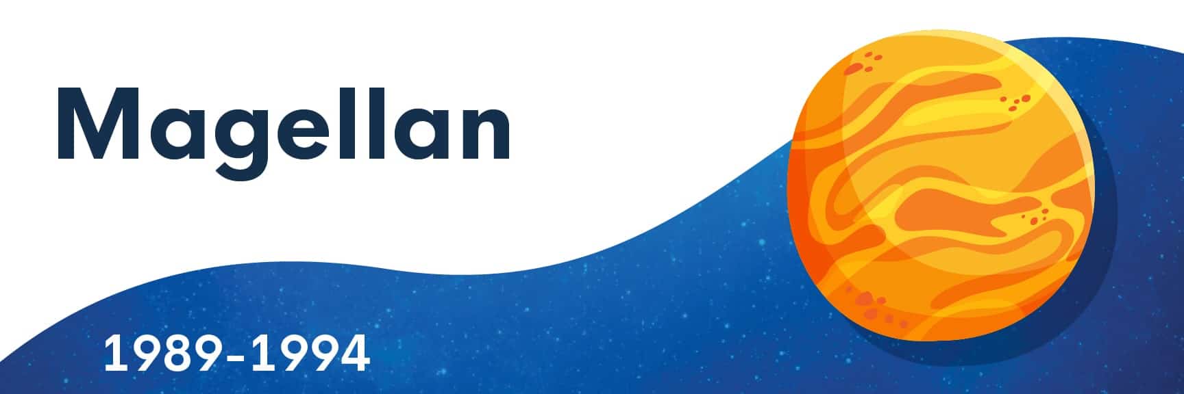
We even illustrated signs for each of the seven operatories (rooms) that the doctor named after influential American space missions.
Image
Image
Image
Image
Image
Image
ImageImageImage
ImageImageImage
Image
Image

WORK
FLOW

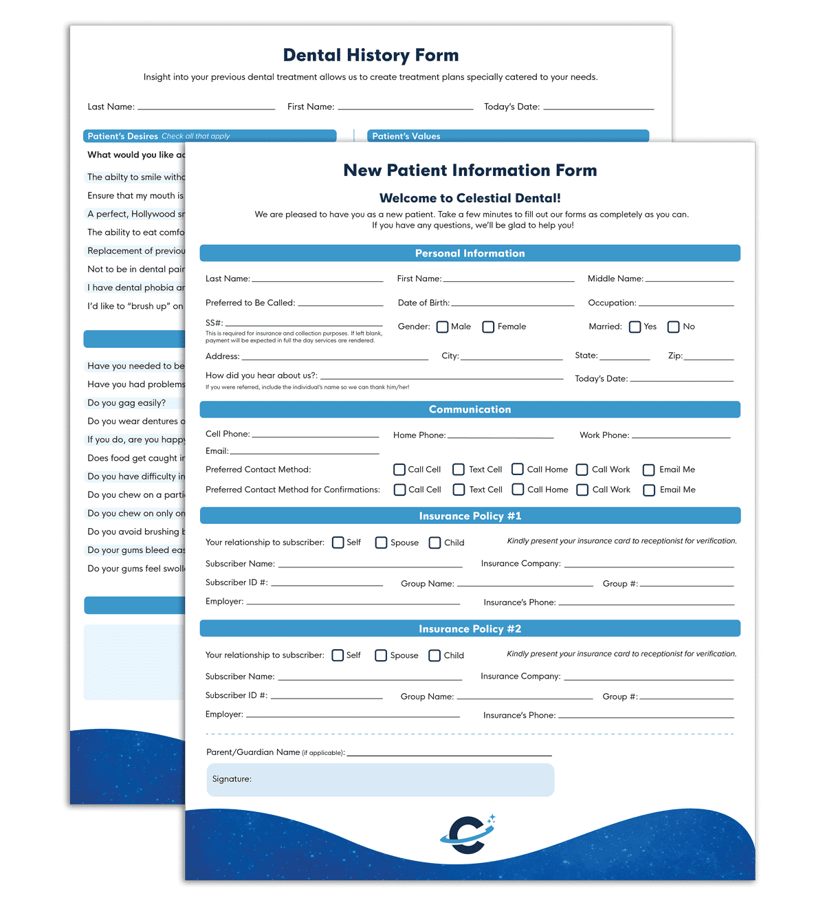
Continuing to nail the brand's first impression, we designed the patient intake forms to follow suit with all other branded materials.

Not only did we integrate them with Celestial's third-party dental software system to speed up the monotonous intake process, we added a couple whimsical true and false questions, such as "Pluto is a definitely a planet" and "I'd like to 'brush up' on my space trivia" 😆

Workflow additionally included uniform design, email setup with branded signatures, patient communication voicemails, and text message greeting setup.
Image


THE
OFFICE

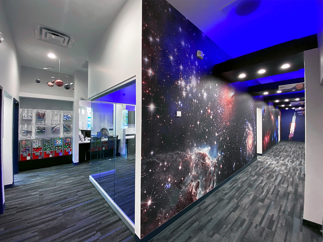
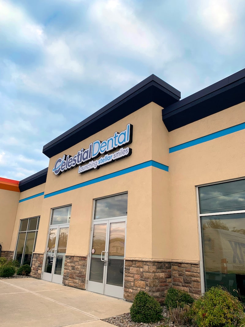
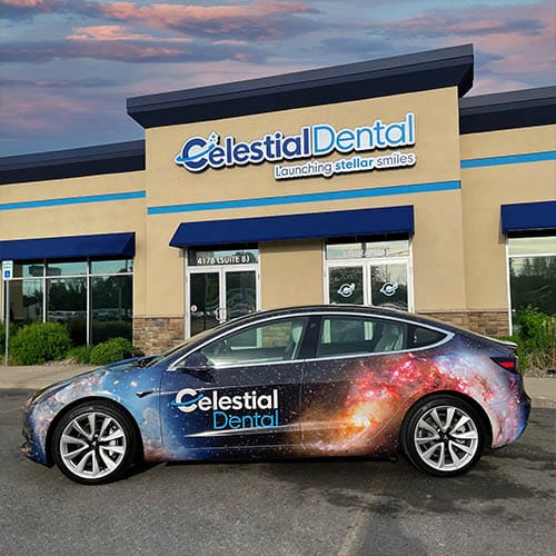
Brand development isn't just a logo. It's every single touchpoint, predominately including the place where the product offering is sold.

UCO was a critical and essential partner in bringing the very essence of the brand to life into the office space (ha!).

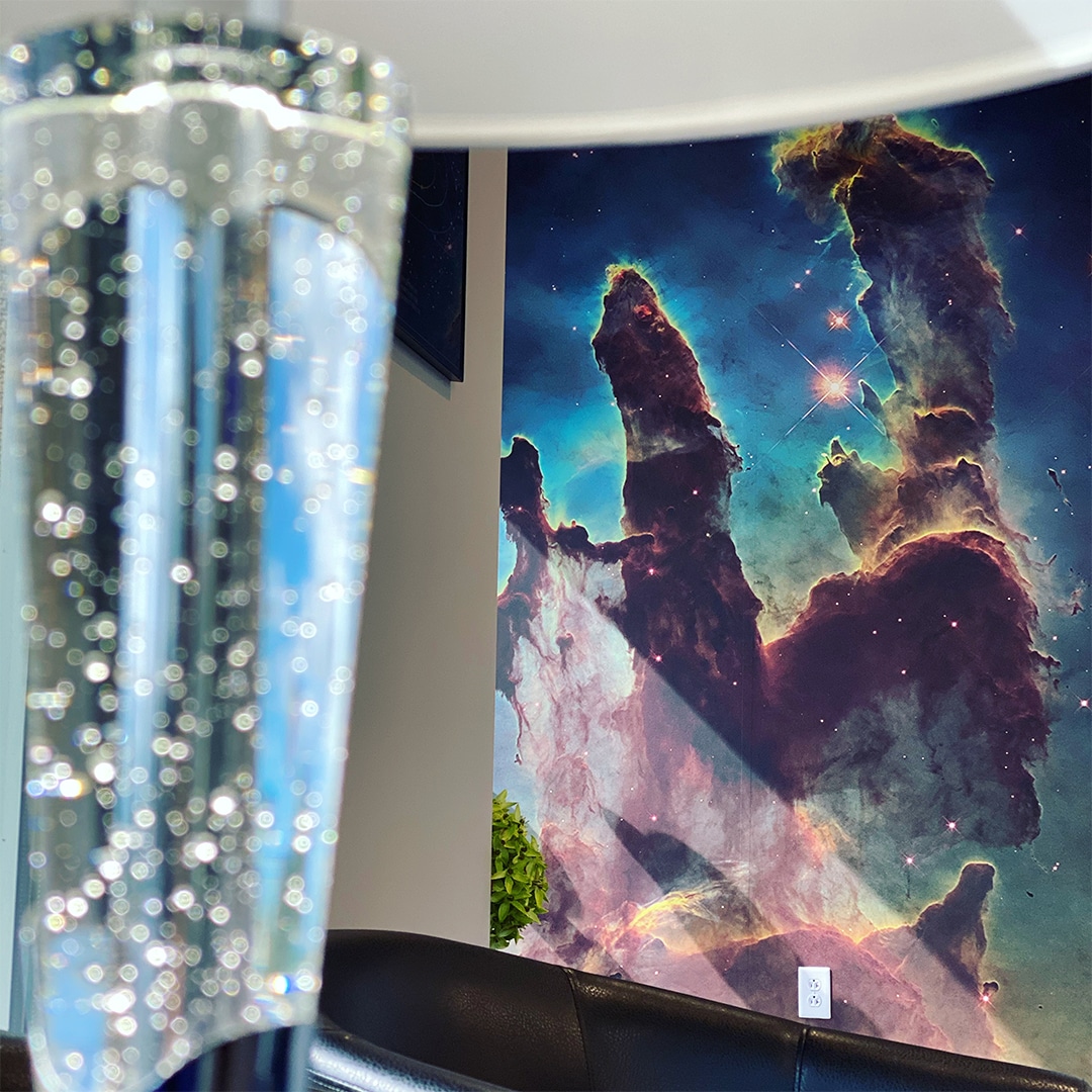
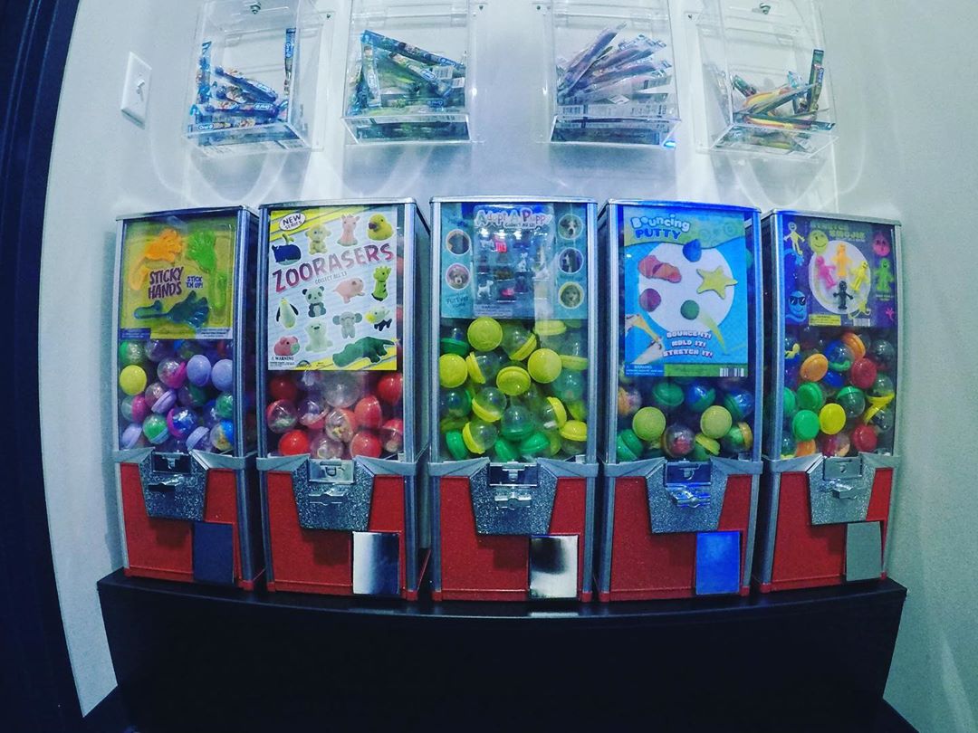
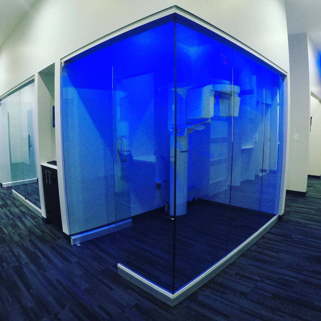
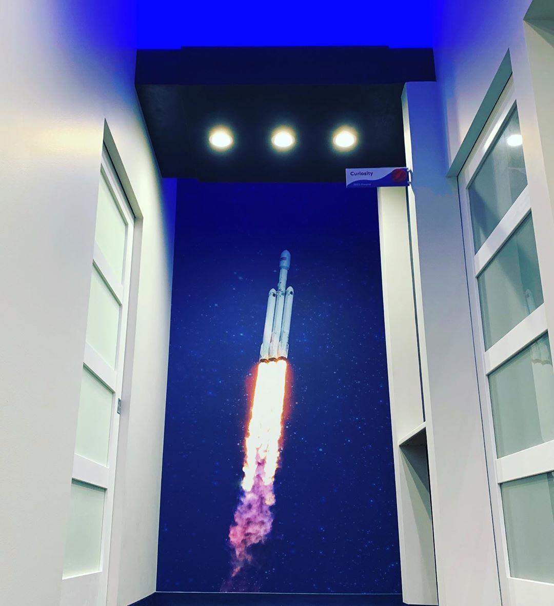
All throughout the exterior and interior of the dental office, we worked alongside the general contractor for a year in reviewing the blueprint build-out of the space to selecting the precise paint, lighting, signage, and decor utilized.

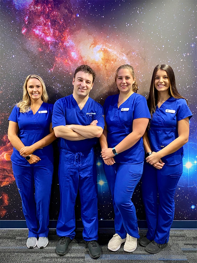
This level of attention to detail allowed for an atmosphere where patients frequently say, "Wow, it doesn't even feel like I'm at the dentist!" Mission accomplished! 🚀

Image
Image
 
 
Image
Image
 
Image
Image

THE
OFFICE

Brand development isn't just a logo. It's every single touchpoint, predominately including the place where the product offering is sold.

UCO was a critical and essential partner in bringing the very essence of the brand to life into the office space (ha!).

All throughout the exterior and interior of the dental office, we worked alongside the general contractor for a year in reviewing the blueprint build-out of the space to selecting the precise paint, lighting, signage, and decor utilized.

This level of attention to detail allowed for an atmosphere where patients frequently say, "Wow, it doesn't even feel like I'm at the dentist!" Mission accomplished! 🚀

Image
Image
Image
Image
Image
Image
Image
Image
Image

Are you a fit for us?

Mom-and-pop businesses have the same issues as the Fortune 500. The difference is that big companies spend millions on consultants to fix them.
Book Marketing Assessment

Are you a fit for us?

Mom-and-pop businesses have the same issues as the Fortune 500. The difference is that big companies spend millions on consultants to fix them.
Book Marketing Assessment
Image