THE
LOGO
After walking through many acres of the farm, we knew right away that it was important to harness the organic, shabby chic, rustic, classic vibe of the area, meshing perfectly with the owner's intended vision.
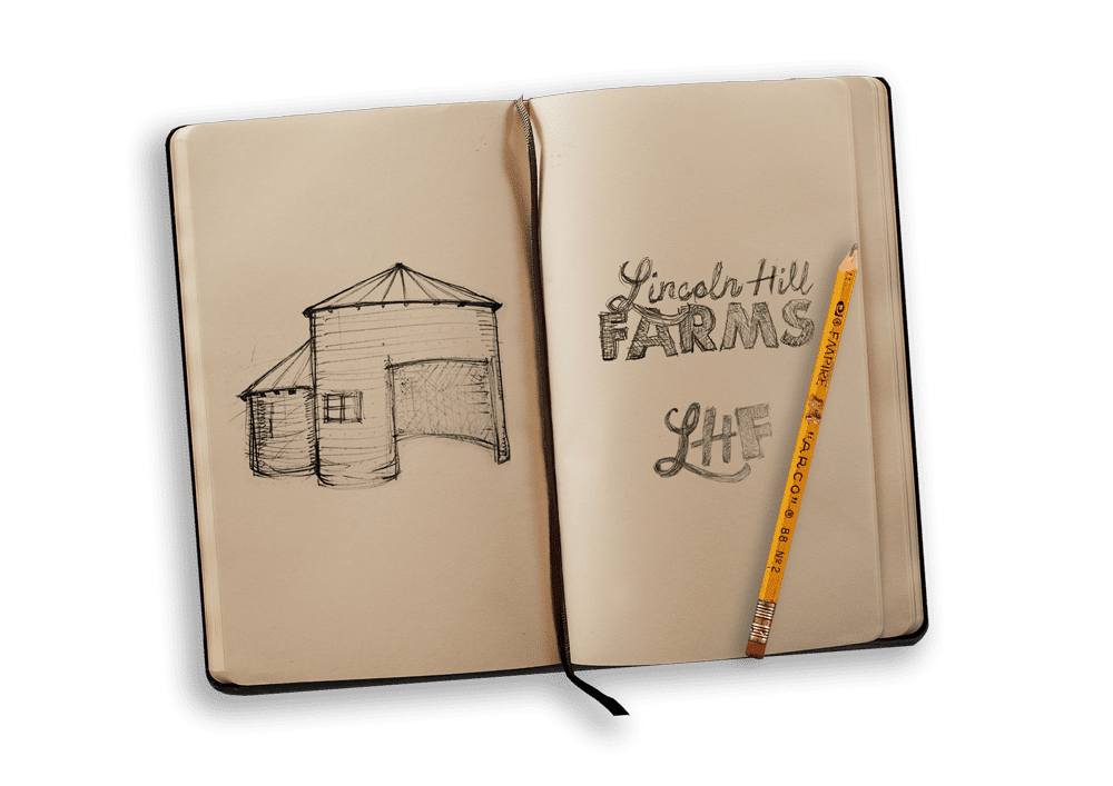
We additionally wanted to incorporate the lone silo on the property alongside eventual hop fields. Altogether, these ideas resulted in us sketching several iterations until we found the perfect lettering and style for the brand.

ON THE MAP
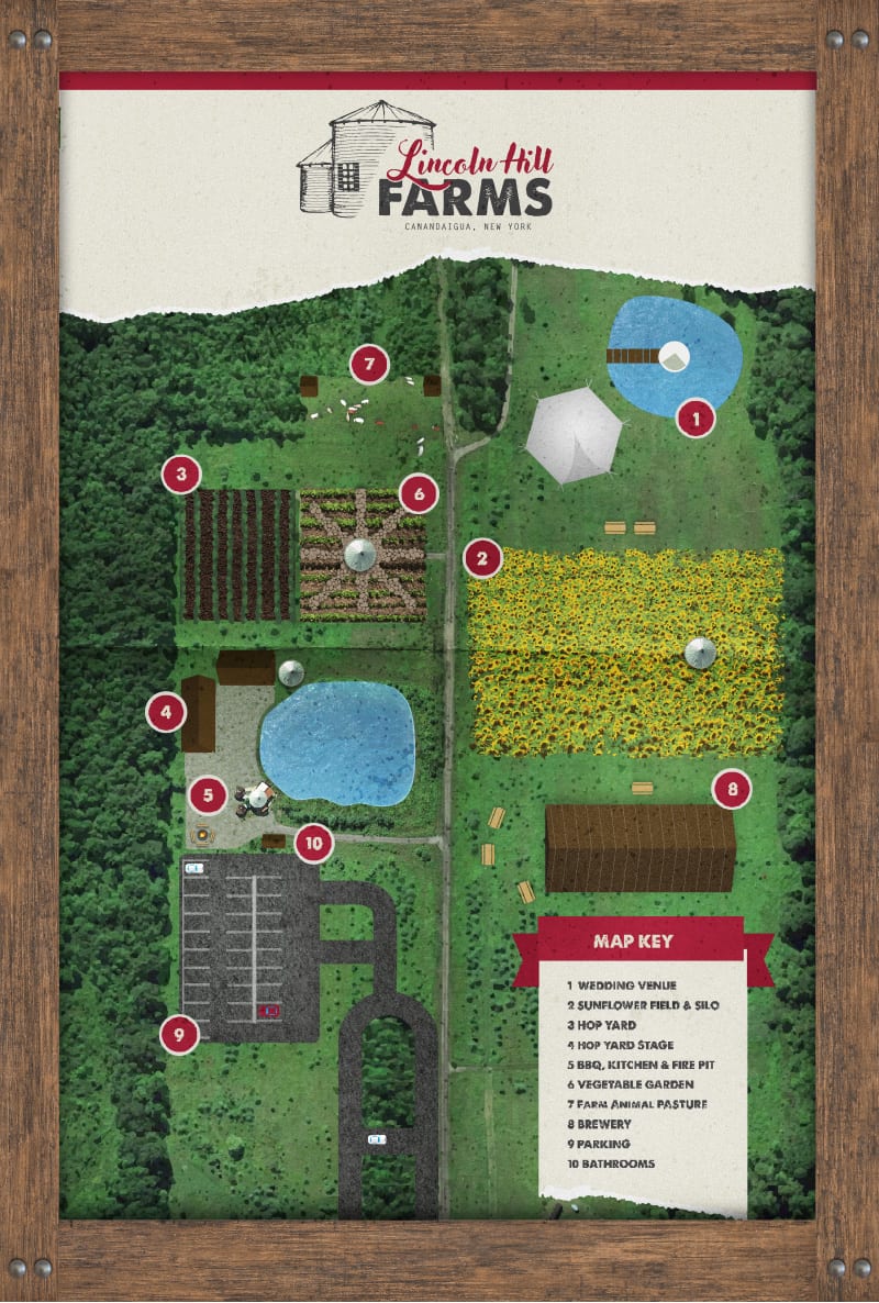
In order for visitors to understand their whereabouts, we hand-drew and illustrated a full map of the Lincoln Hills property.
The map was easy to read and true to scale all while presenting the land's combination of serenity and excitement and maintaining the brand's picturesque quality.

IN
PRINT
We provided branded mock-up visuals to assist in understanding and educating how to carry the Lincoln Hill Farms brand forward as an internal team.


DAVID vs. GOLIATH
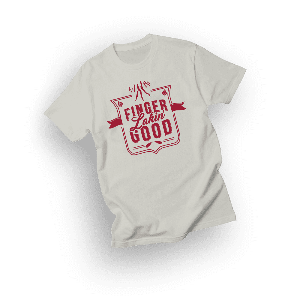
To strengthen the surrounding area of the LHF brand, UCO designed a logo for the concept "Finger Lakin' Good".
As a result, Kentucky Fried Chicken, threatened the vision by the name sounding too similar to "Finger Lickin' Good" - despite being in a different industry altogether.
With direct support from the community in branded t-shirt sales and news sources, LHF was able to stand a real fighting chance against this corporate giant.
A FAMILY OF BRANDS
Upon completion of developing the brand identity for Lincoln Hill Farms, we developed two other co-related brands that would effortlessly and seamlessly connect with the initial brand.
We accomplished this by using similar styling and incorporating hand-drawn assets for each brand, but still giving each brand identity its own unique features.


