Master Falafel

MASTER
FALAFEL

Brand Identity Development (New Logo!)
Website Development
Photo Production, Art Direction, Editing
Creative Communications

MASTER
FALAFEL

Brand Identity Development (New Logo!)
Website Development
Photo Production, Art Direction, Editing
Creative Communications

The
Challenge

Master Falafel is more than just a restaurant in Rochester, NY – it's a celebration of the dedication and resilience of a Syrian refugee determined to showcase the cuisine of his homeland.

When approached, the owner faced the challenge of establishing credibility as a young, non-native English speaking restaurateur in a highly competitive industry.

Through strategic brand identity development, we successfully created a unique brand (and name!) that sets Master Falafel apart from typical "ma and pa" Middle Eastern establishments while maintaining a local yet franchisable feel.

Image

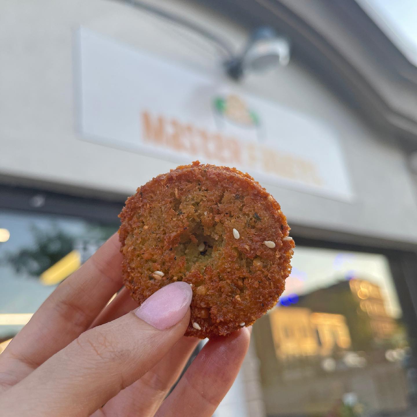
YOU'LL FALL FOR OUR FALAFEL
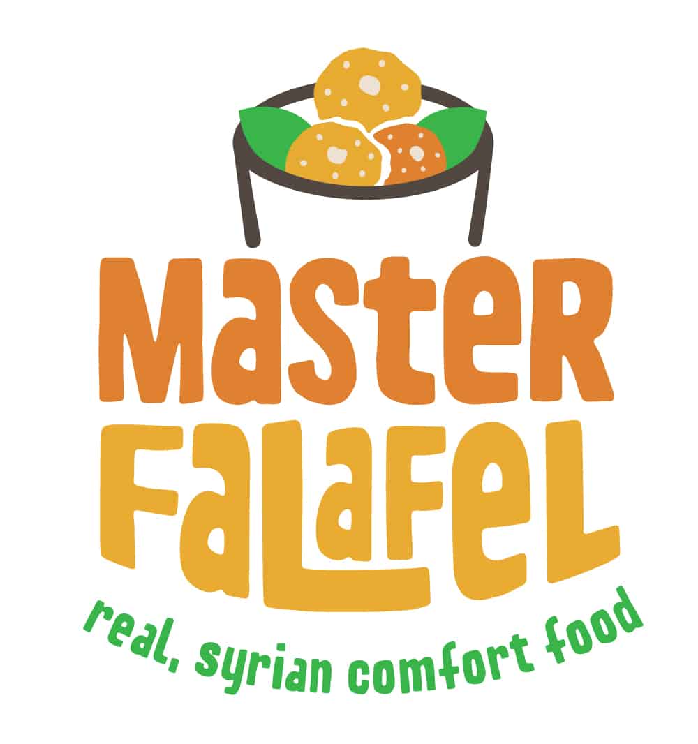
THE
LOGO

We approached the Master Falafel brand identity with the goal of creating a bridge between the Middle Eastern culture and Americanization. We strove to design a brand and logo that felt friendly, fresh, light, positive, and approachable while maintaining an Americanized feel. We were confident that attracting non-Arab customers to the brand would naturally spread across the Arab community, thanks to the owner's close connection with it.

Image
Image
 
Image
Image

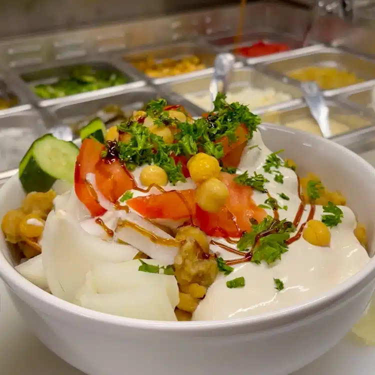
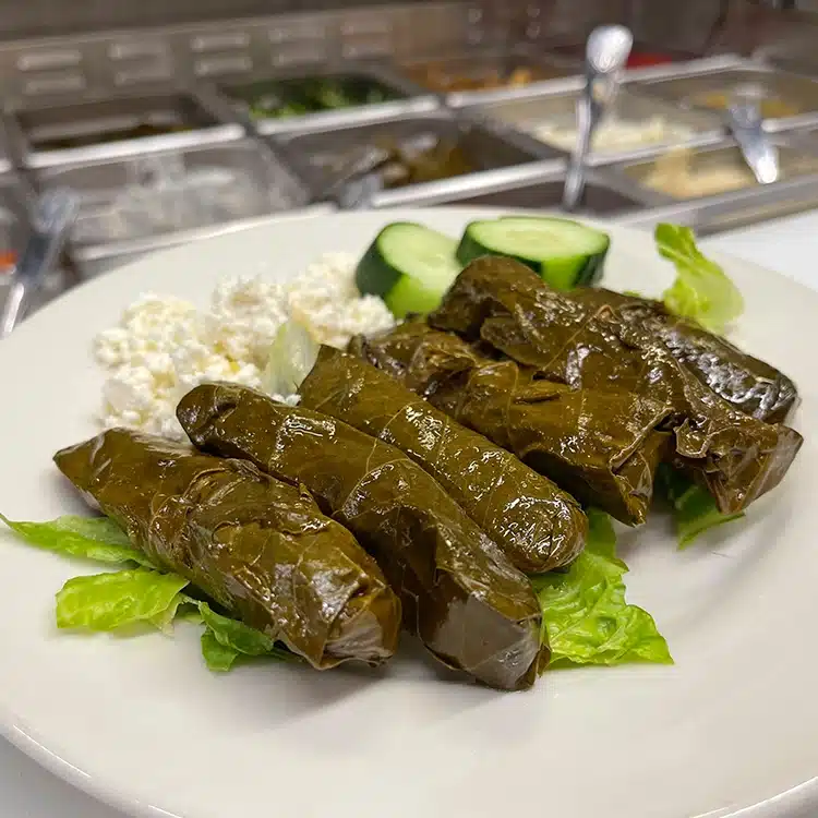
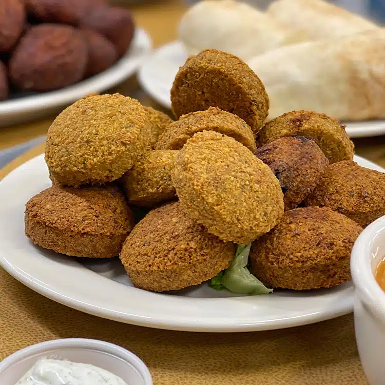
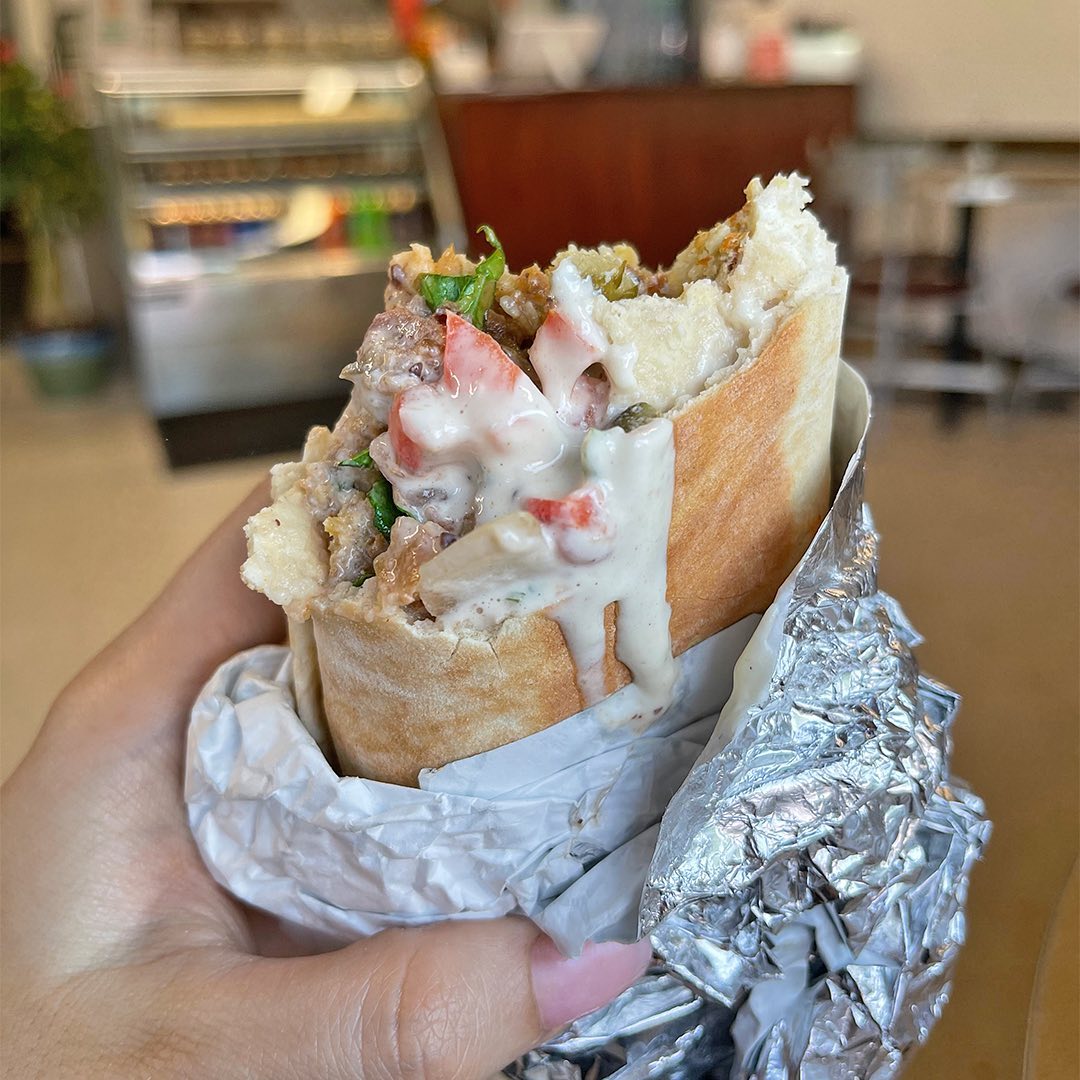
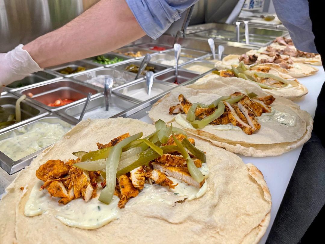
REAL, SYRIAN, COMFORT FOOD
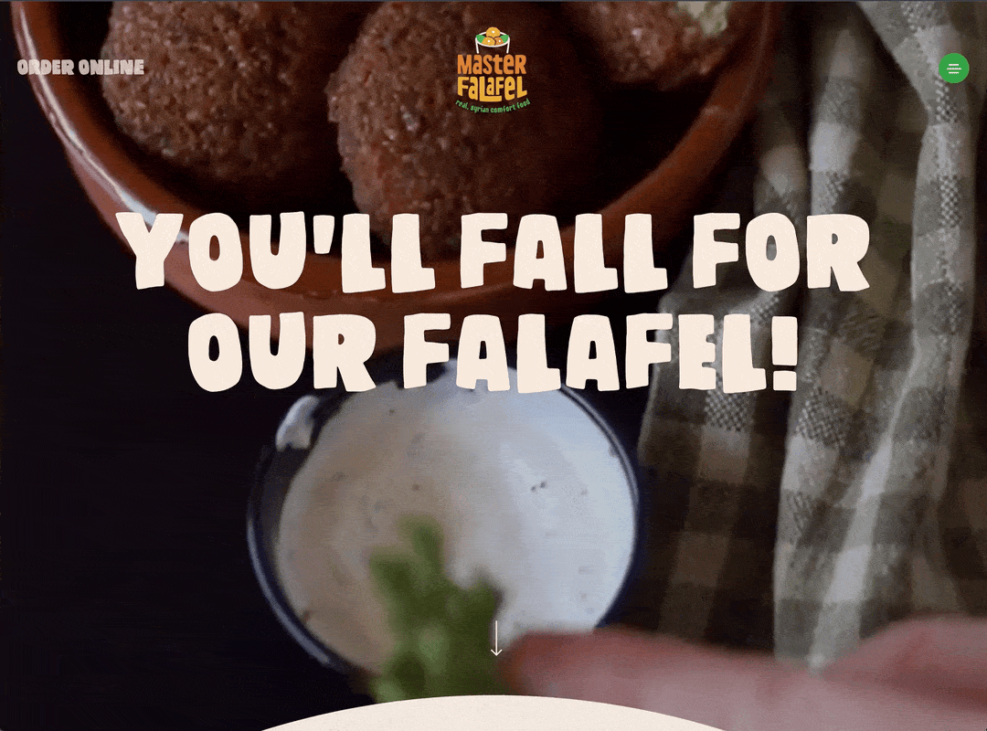
ON THE
WEB

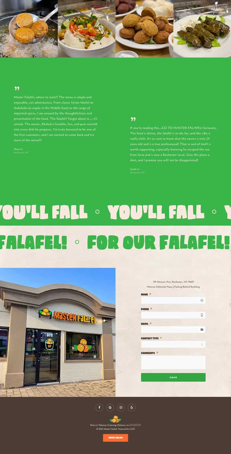
We designed a new website that was not only visually appealing but also made it easy for customers accustomed to their go-to Middle Eastern restaurants to quickly gain trust in the brand, find essential information, and place orders online. We also refined the branded elements on the third-party online ordering platform to ensure a seamless user experience.
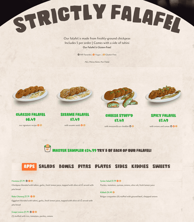
1.

We wanted customers to feel the movement and liveliness of Falafel at first glance, within the first three seconds of engaging with the brand online.

Image

2.

Upon visiting the website, customers can easily find the menu, which is clearly displayed with uncomplicated details and smooth transitions.

This allows the brand to take the customer through the menu seamlessly.

Image

3.

The inclusion of section breaks was crucial in valuing the customer's time.

The use of suitable brand colors in each section ensures that they are easy to read, allowing users to quickly grasp the content without having to read extensively.

ImageImage

DIGITAL
BOARDS

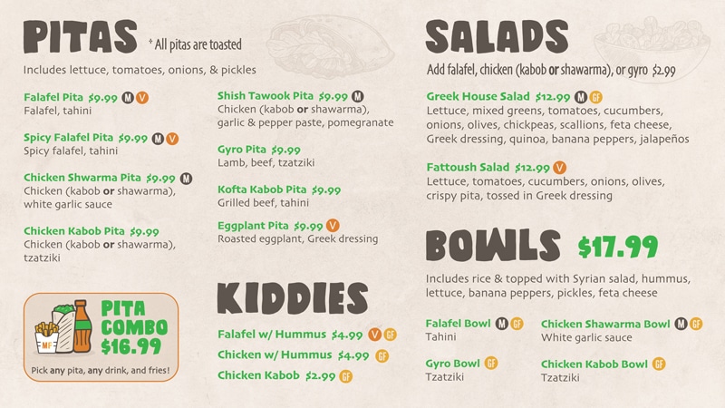
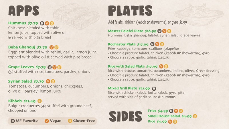
We provided end-to-end digital menu board design and management using three TVs on the premises.

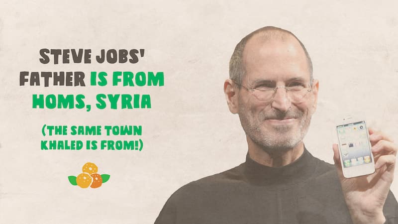
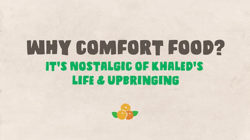
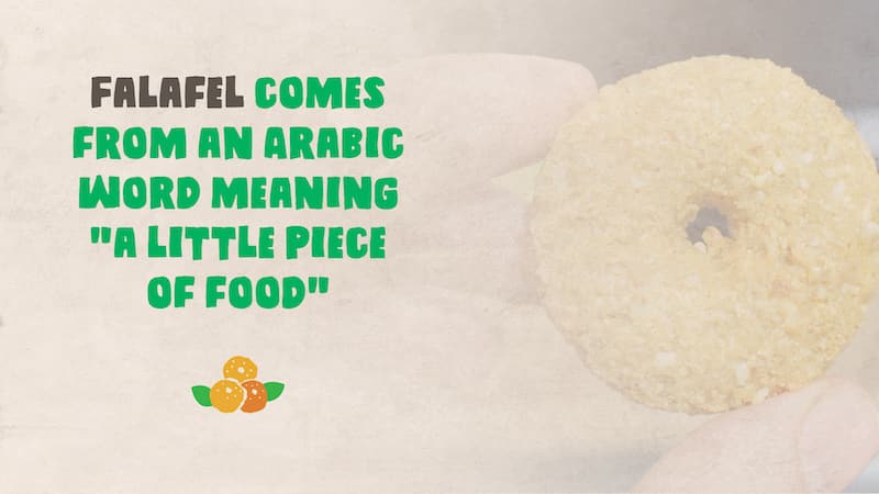
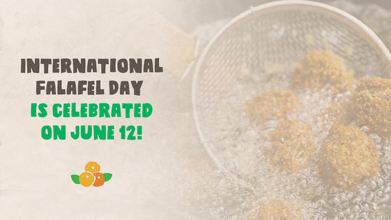
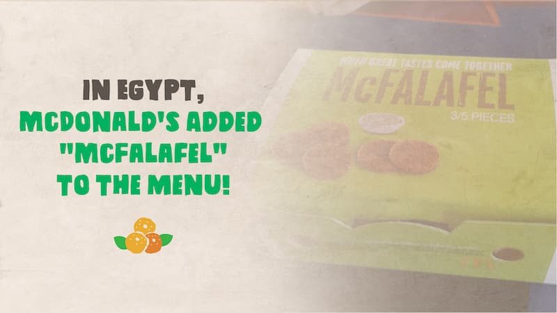
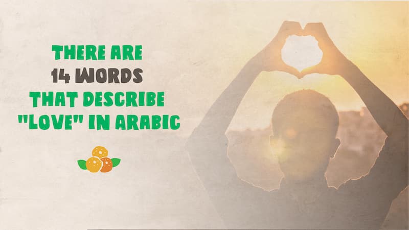
In an effort to make the Middle Eastern culture and lifestyle feel more familiar to Americans, we added an in-store slideshow featuring topics that Americans could easily relate to. Customers loved this idea and responded positively. They found it easier to connect with the Arab culture and way of life.
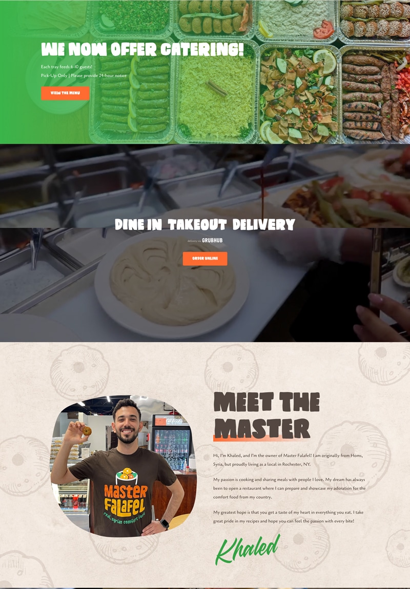
Image
Image
Image
Image
Image
Image
Image
Image
Image
 

IN
PRINT

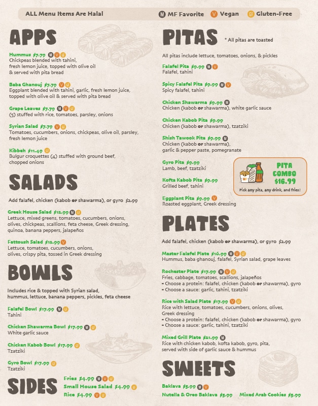
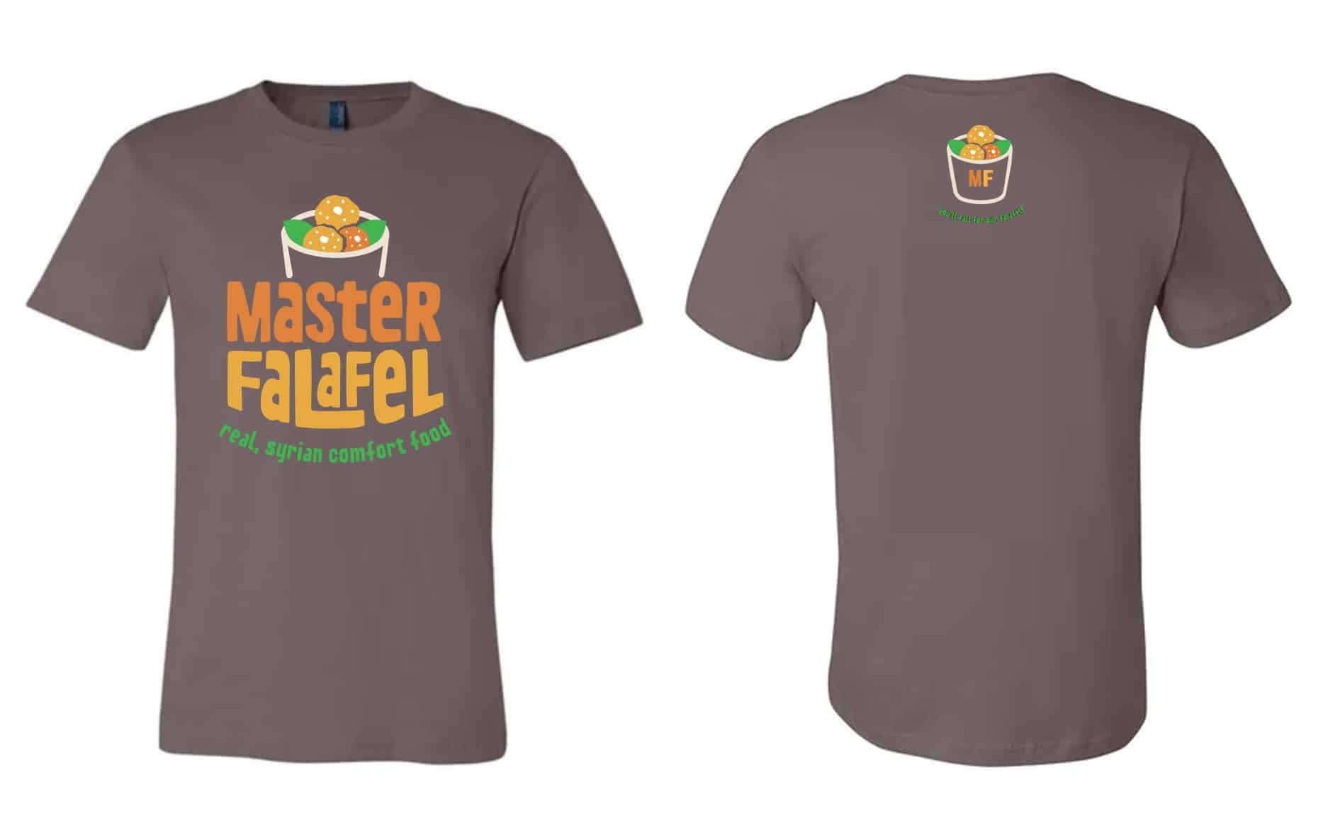
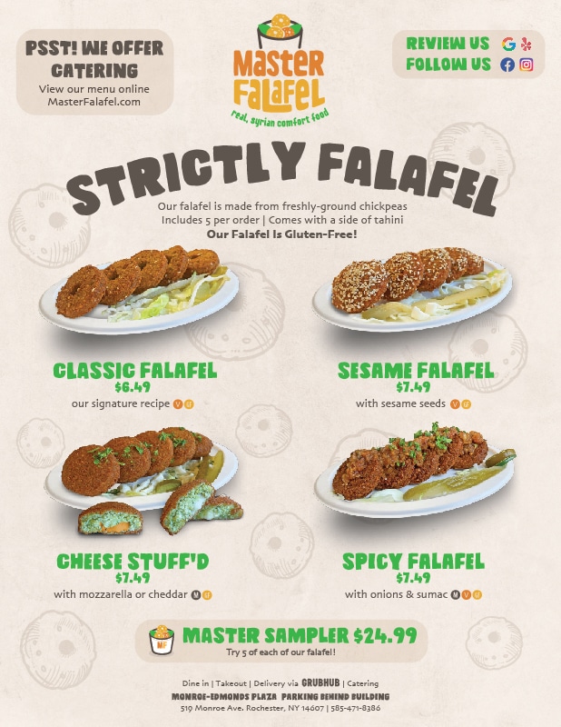
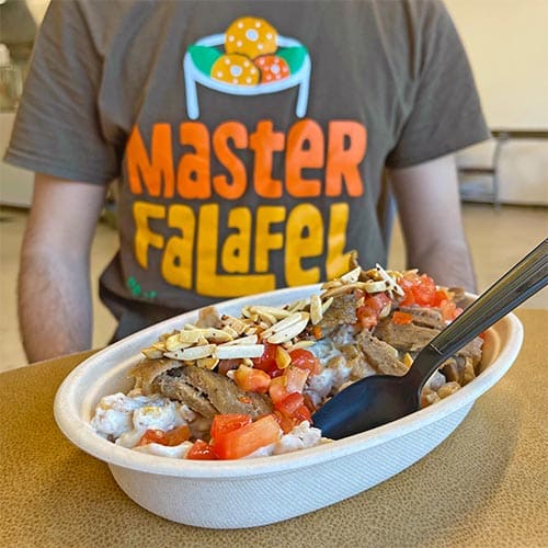
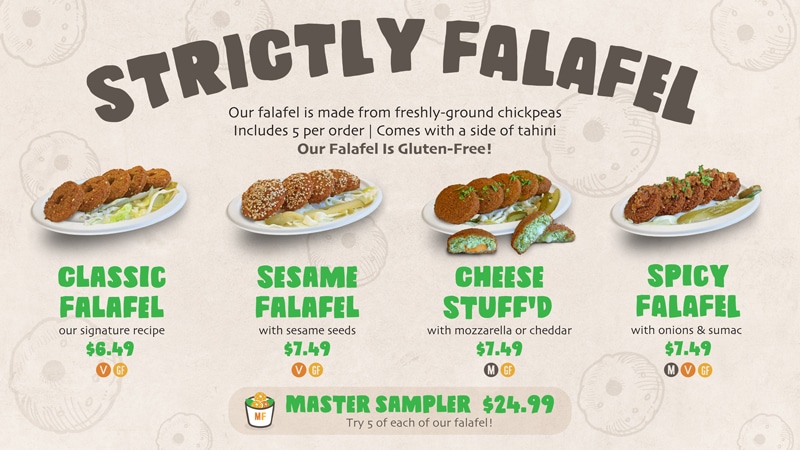
We created custom illustrations of the owner and made him look cool and hip as a modern, millennial restaurant owner. We then designed uniforms and menus that we update six times per year. We also created corporate collateral, including business cards, letterheads, and email signatures.

ImageImage
Image
Image
Image
Image
Image
Image

PHOTO
& Video

We took guerrilla-style photos of the brand and the atmosphere to help set the tone for social media efforts on Instagram and Facebook. The colors were enhanced to create a stronger connection between customers and the brand.

Image
Image
 
 
Image
Image
 
 
Image
Image
Image
Image
 
 
Image

PHOTO
& VIDEO

We took photos of the 4.0 Storage owners and different tiered employees to better communicate the "team vibe".

When establishing the new brand, we knew how important it was for customers to see how the 4.0 members are evidently aligned to the characteristics of approachability, friendliness, preparedness, and team work.

Image
Image
Image
ImageImageImage
Image
Image
Image
Image

Are you a fit for us?

Mom-and-pop businesses have the same issues as the Fortune 500. The difference is that big companies spend millions on consultants to fix them.
Book Marketing Assessment

Are you a fit for us?

Mom-and-pop businesses have the same issues as the Fortune 500. The difference is that big companies spend millions on consultants to fix them.
Book Marketing Assessment
Image