THE
LOGO
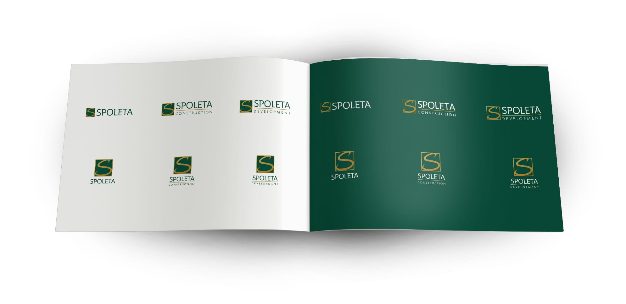
Formerly known (but best known) as Spoleta Construction, the company had grown beyond construction and deeply into site development.
As a result, UCO refined its current logo, typeface, and color palette. Thereafter, UCO designed multiple versions of a contemporary logo for the umbrella company to complement the newly-established flexibility of the brand.

IN
PRINT
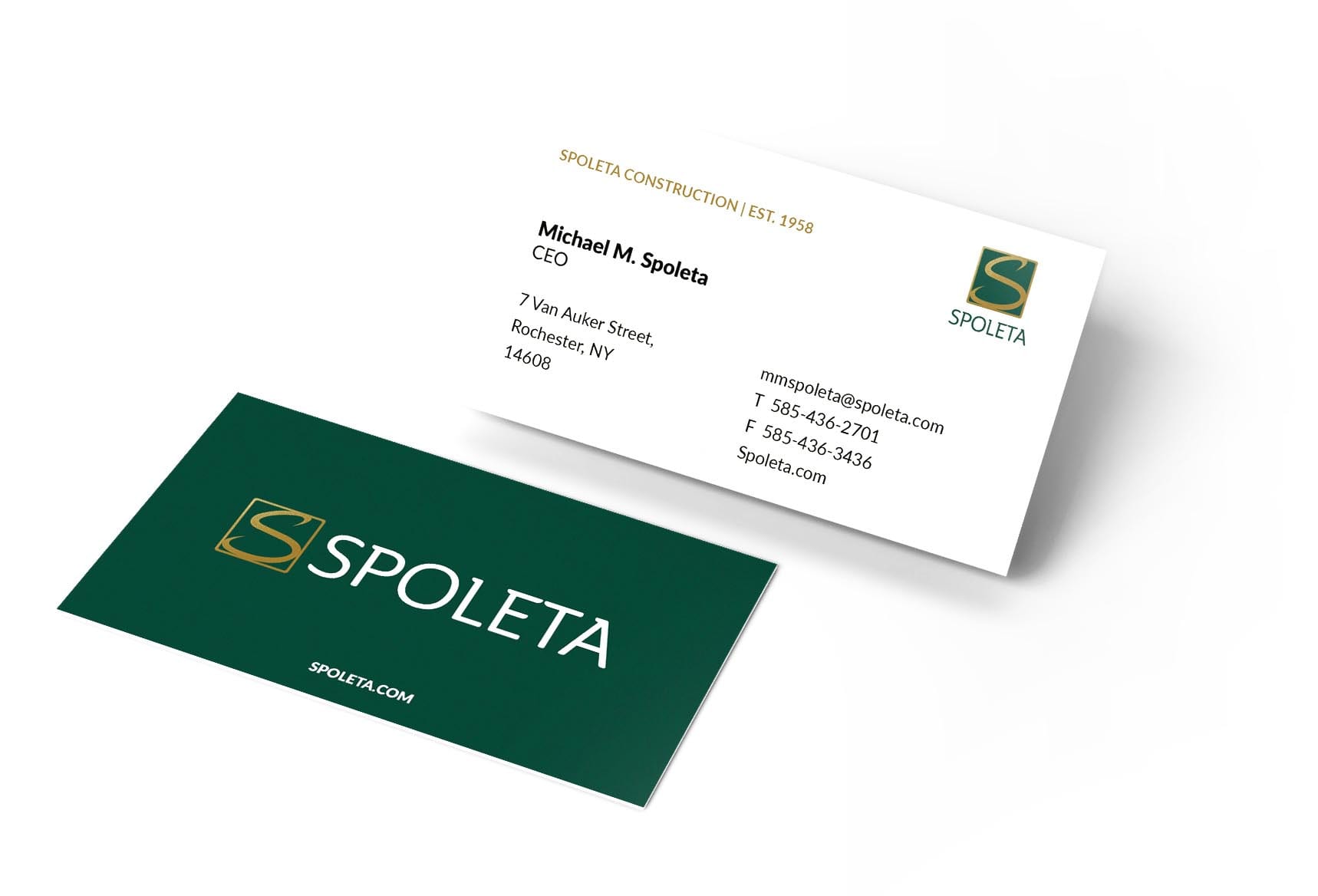
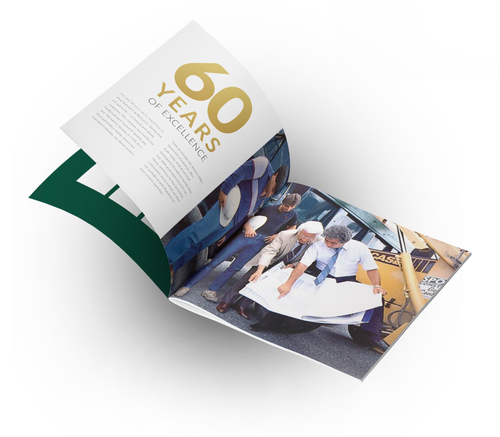
To visually reflect Spoleta’s quality, thoughtfully-authentic, and vision-oriented work delivered, all brand collateral was concepted and designed with gold foil and exclusively high-end print materials.
Among these materials included newly-designed business cards as well as a 40-page booklet of comprehensively detailed services and portfolio.
ON THE
WEB
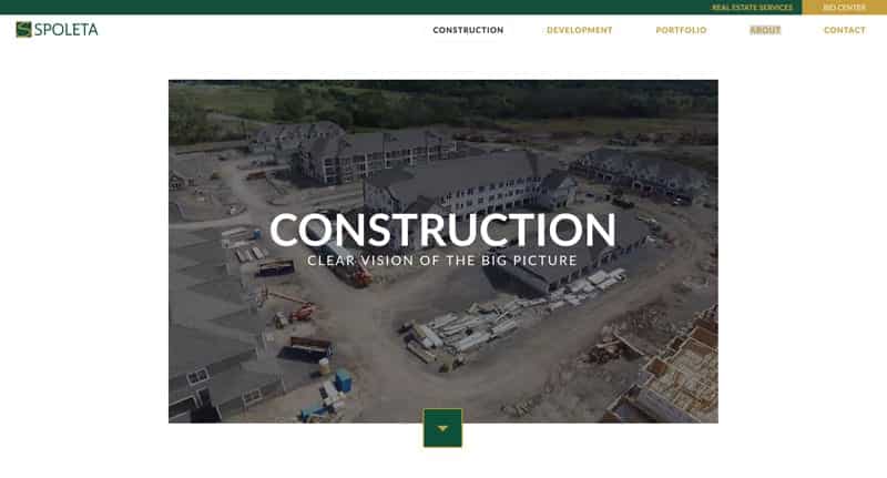
UCO compiled an opening home page video (view below) as a window which directly immerses the visitor in Spoleta’s quality of work, dedication, and the communities it creates and operates. Pre-shot drone footage was particularly befitting due to the large-scale nature of construction projects.
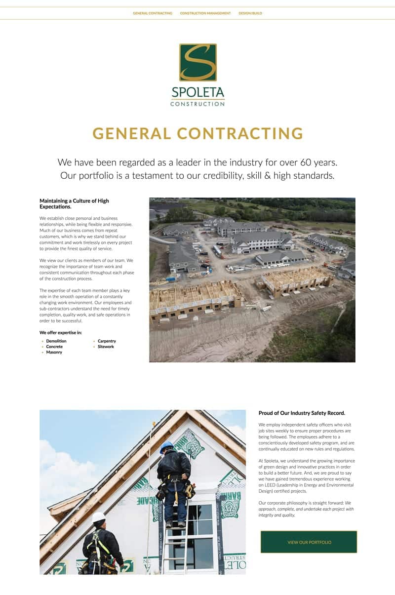
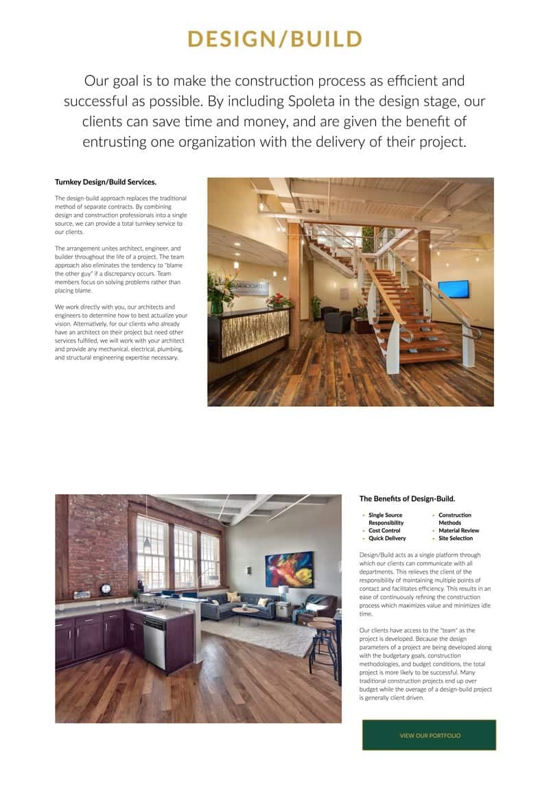
Overall, the entrance to the site gives the visitor a feeling of cohesive grandeur and organization, perfectly reflecting the company’s reputation and values.


THE
PORTFOLIO
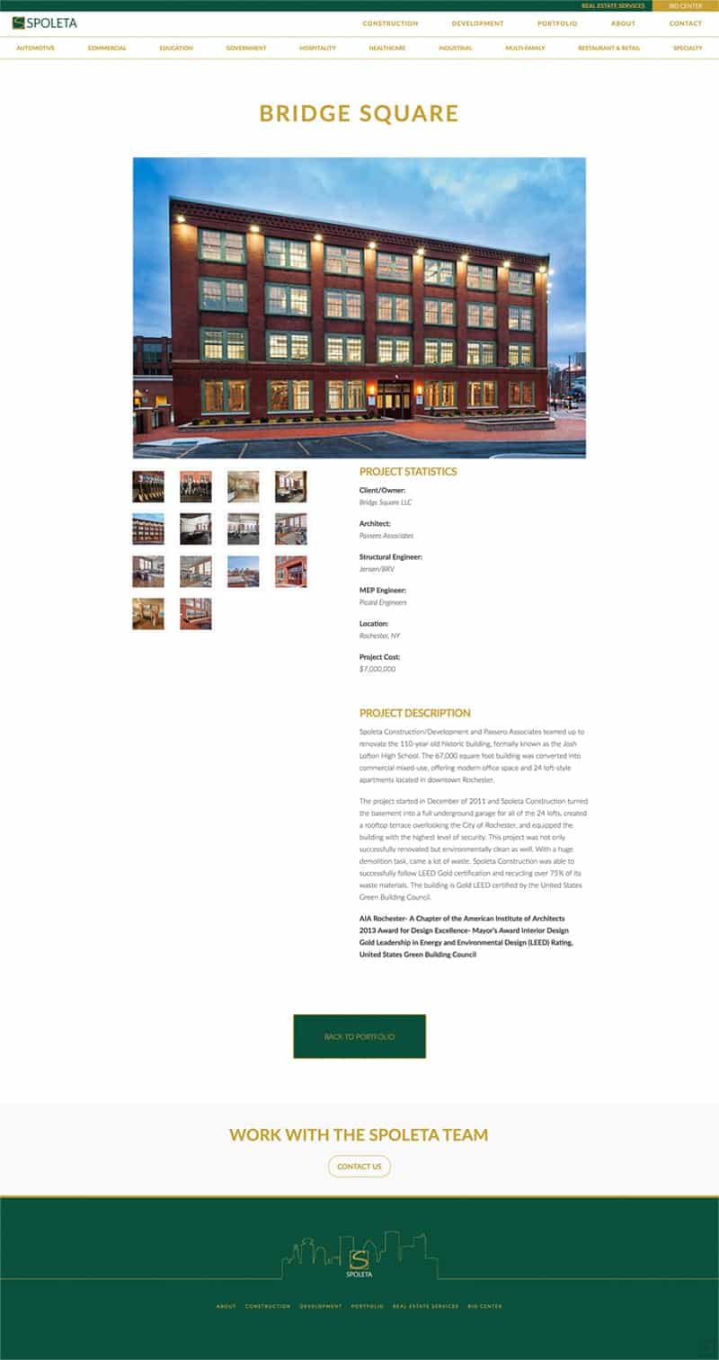
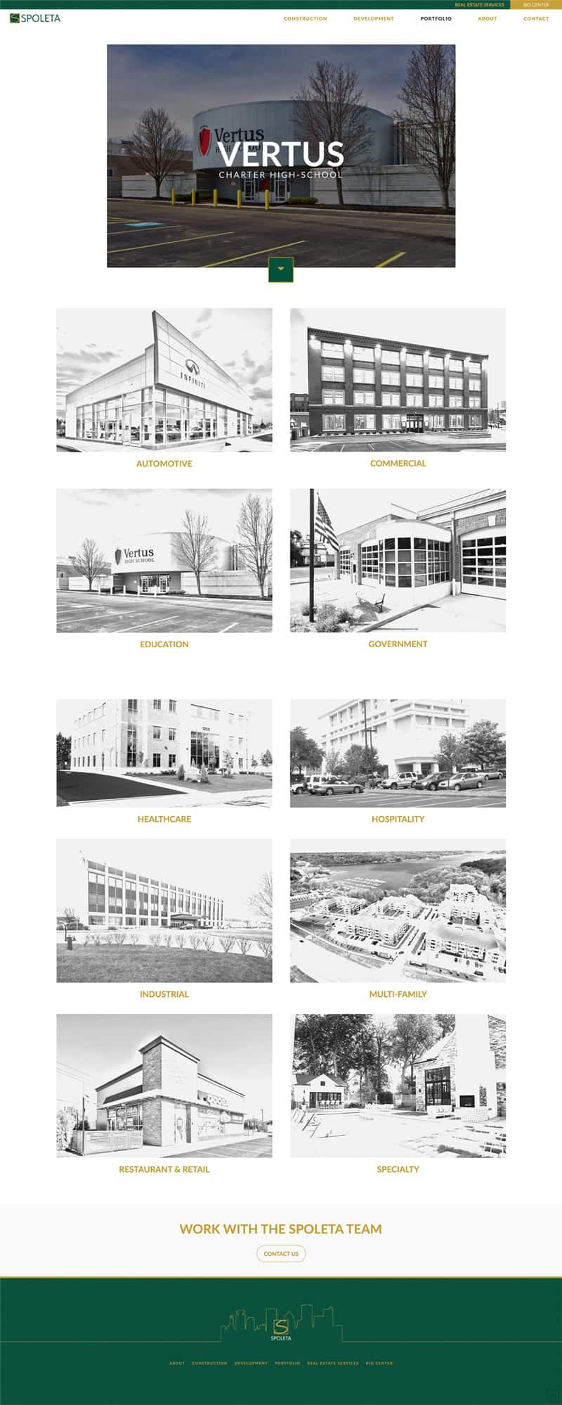
All portfolio pages were revitalized with updated photography and modern-artistic finishes. While the photos alone speak for the projects themselves, each project page also includes a detailed description about the work - giving more depth and information to the viewer than ever before.
THE
TIMELINE
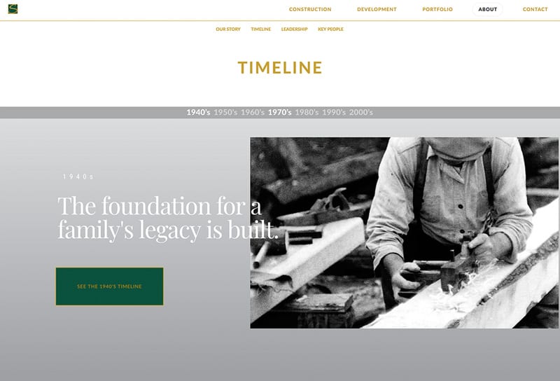
The history of Spoleta was one of the most important initiatives that the company wanted to showcase on their new website. Consequentially, UCO dove deeply into the brand's past by speaking with the family and flipping through countless photo albums to better understand the core.
As a team, we pulled out key historical events and well-known local landmarks to incorporate into an interactive portion of the new website. As a result, this has served as grounding-points that remind the community of Spoleta’s ties since its inception.
